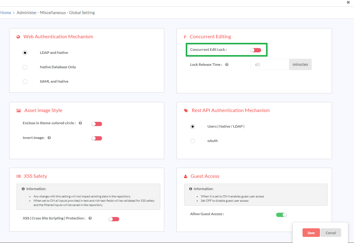
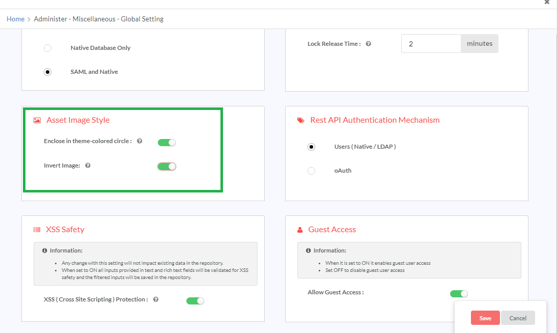
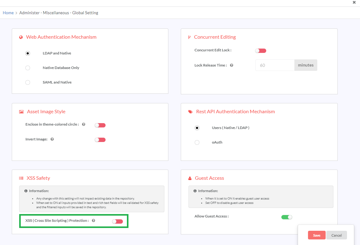
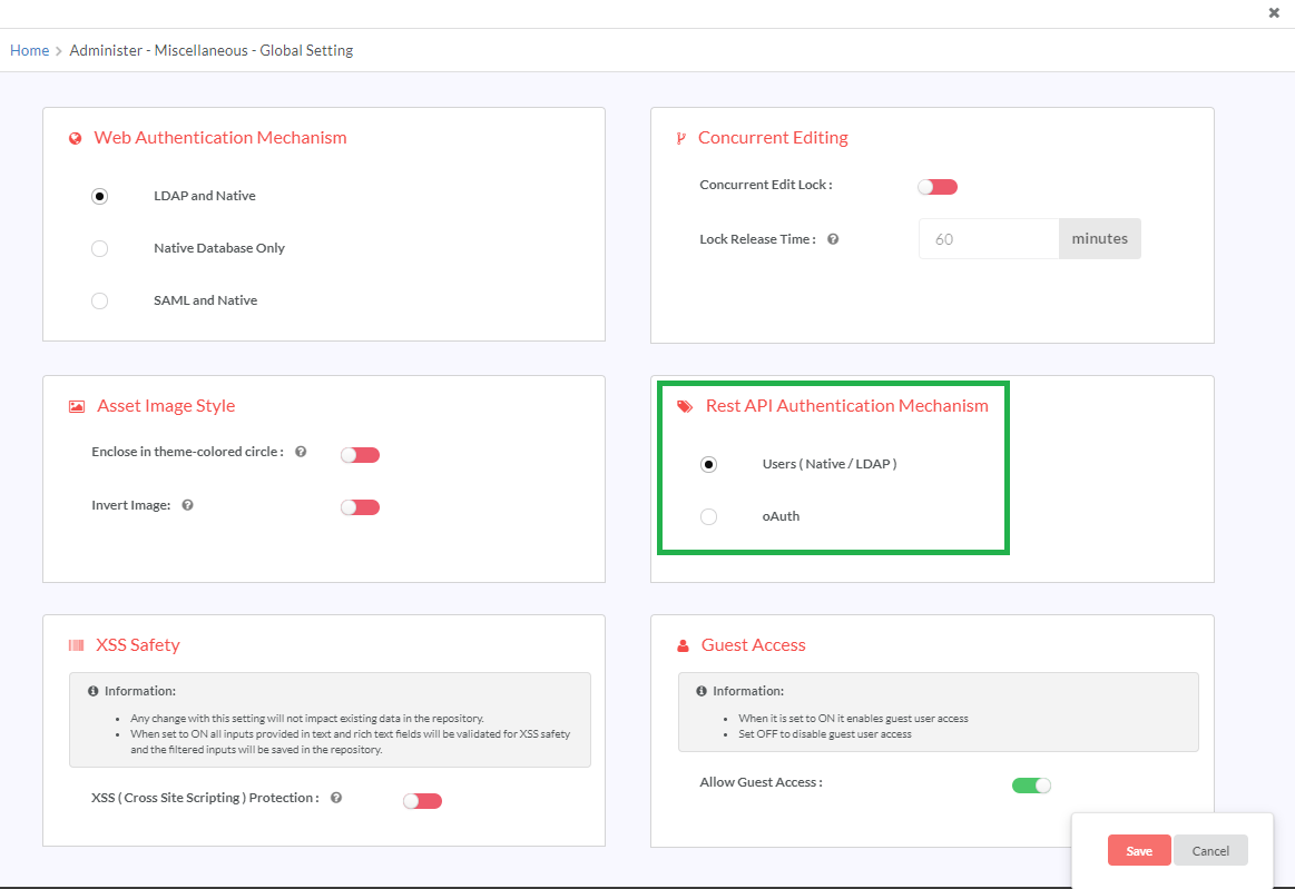
9. Administer
9.1. Overview
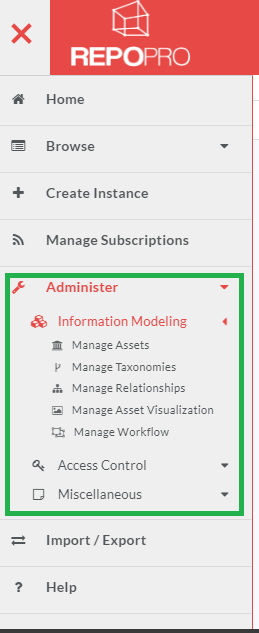
RepoPro provides its users all the options to configure/administer the product through its Administer menu. It has options grouped under sections: Information Modeling (Manage Assets, Manage Taxonomies, and Manage Relationships), Access Control and Miscellaneous. The subsections below describe each option in detail.
9.2. Manage Assets
RepoPro allows its users to model constructs as versionable Artifact Types, defining its metadata through parameters and grouping them into categories.
It provides the users with interfaces that allow them to:
- Create new Asset Types specifying whether an Asset Type is versionable, is a system asset, has access permissions and associate Taxonomies with the Asset Types.
- Add Categories with Parameters for each category, specifying the supported data types as date, file, text, list (custom list, native user list, LDAP user list and asset list), Derived Attributes, Derived Computations, Derived attributes for Asset List and LDAP attribute mapping. To learn more about Parameter Types, refer: Properties and Parameter Types.
- Define a Parameter to hold a static value; all the instances of the Asset Type share the latest updated value for that Parameter as opposed to each Asset Instance having its own value for the Parameter.
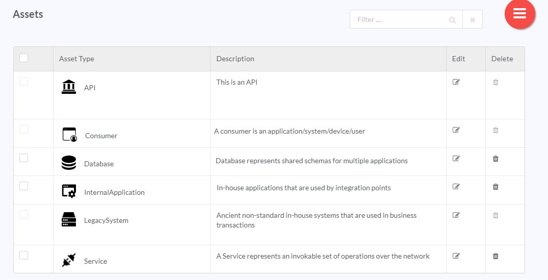
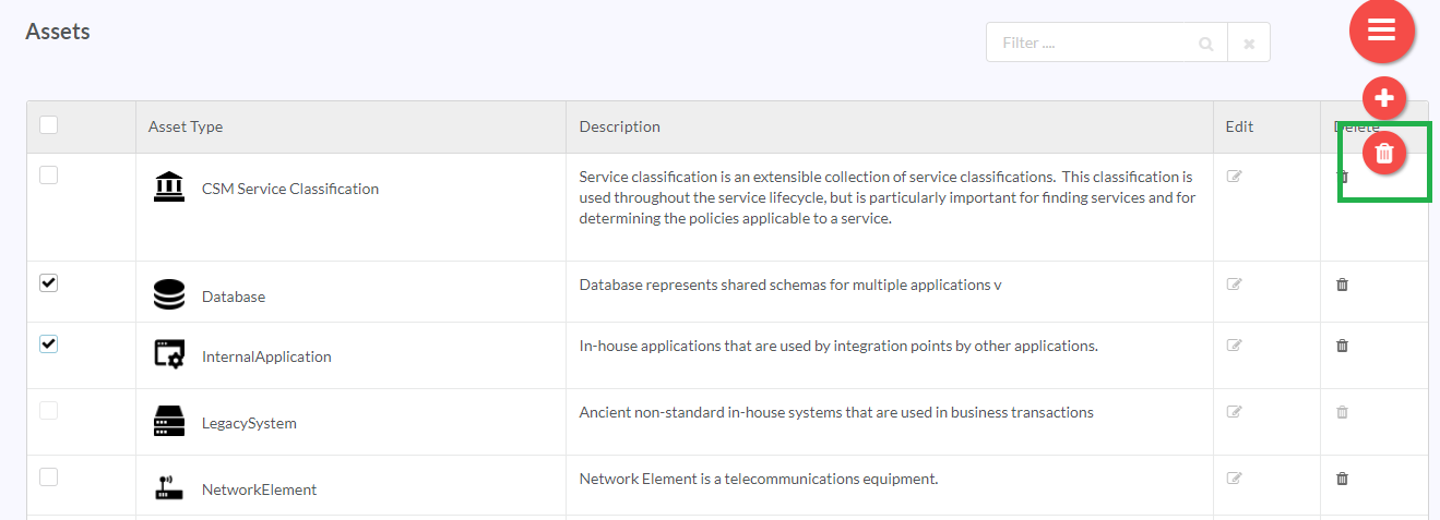
The Administer > Information Modeling > Manage Assets screen gives a grid-view of all the Asset Types created in the repository. It displays the Asset Types in an alphabetical order. It also has options to create new Asset Types, edit and delete existing Asset Types.
The Manage Assets screen provides an infinite scroll view. While scrolling downwards, a scroll icon appears. Click the scroll icon  to be re-directed to the top of the page.
9.2.1. Add or Edit an Asset Type
The Assets screen contains all the Asset Types available in RepoPro.
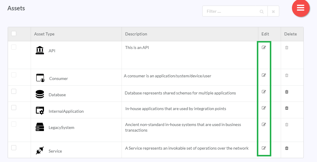
To edit an Asset Type, in the Assets screen, click the Edit icon (![]() ) in the Edit column
) in the Edit column
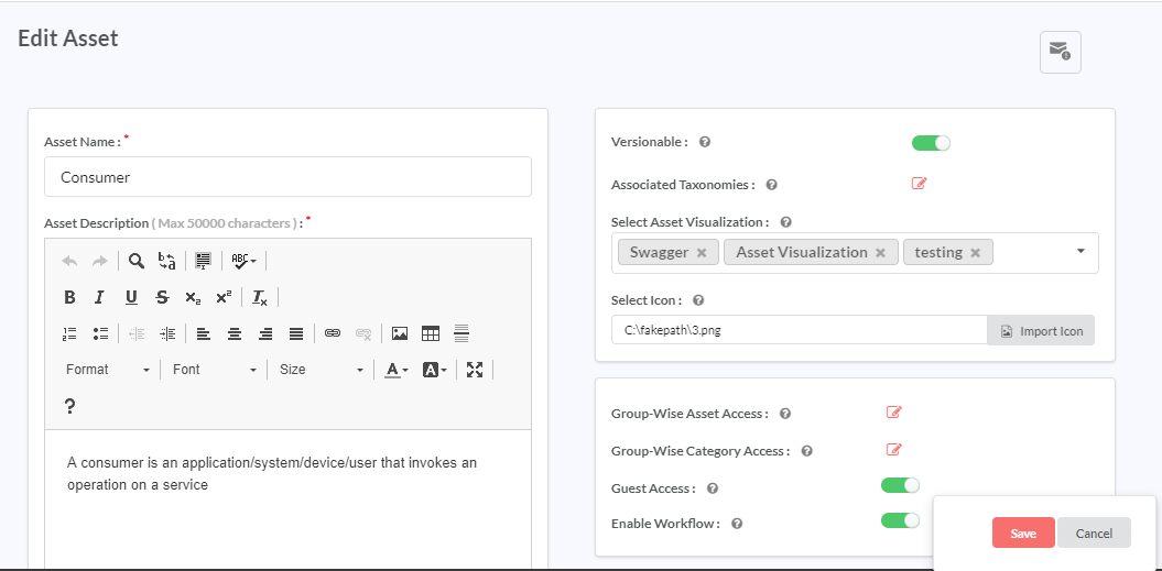
The Edit Asset screen has populated fields from the selected Asset Type. To edit the fields, use relevant edit options in the steps given below for adding a new Asset Type.
Note
Here are some important points to note while editing an Asset Type:
- Changing the data type for a Parameter from a narrower type to Text does not cause data loss. All the records retain the values assigned to them before the data type change.
- Changing from Text to a narrower type is not recommended. If absolutely necessary, take care to update the values (to “” or as applicable) for all records of the Asset Type for the field before changing the data type.
- Asset type can be renamed.
- Permissions to the default access for the newly created Instance versions can be changed.
- Taxonomies can be assigned or unassigned.
- Parameters can be deleted, renamed, reassigned to another category. There is no impact on values already assigned.
- Categories can be renamed.
- Categories can be deleted. Deleting a Category deletes all the Parameters in that Category.
- The user can manage category-wise Access rights from the Edit Asset screen if the Asset has Category(ies) added to it.
To add a new Asset Type:
In the main Navigation menu, click Administer > Information Modeling > Manage Assets. The Assets screen displays listing all the created Asset Types.
In the Assets screen, click the Hamburger menu (
 ) and then click Add icon (
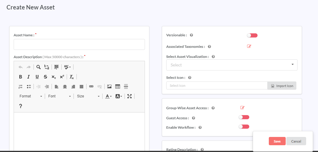
 ) to display the Create New Asset screen.
In the Asset Name box, type in the name of the Asset Type that you wish to create. Use the formatting options available in the rich-text editor interface to make changes to the text or upload an image. Refer Upload an image section under Admin Message.
Note
The Asset Name field can take a maximum length of up to 50 characters.
In the Asset Description box, type in the description for the Asset Type.
Note
The Asset Description text box can take a maximum length of 50000 characters.
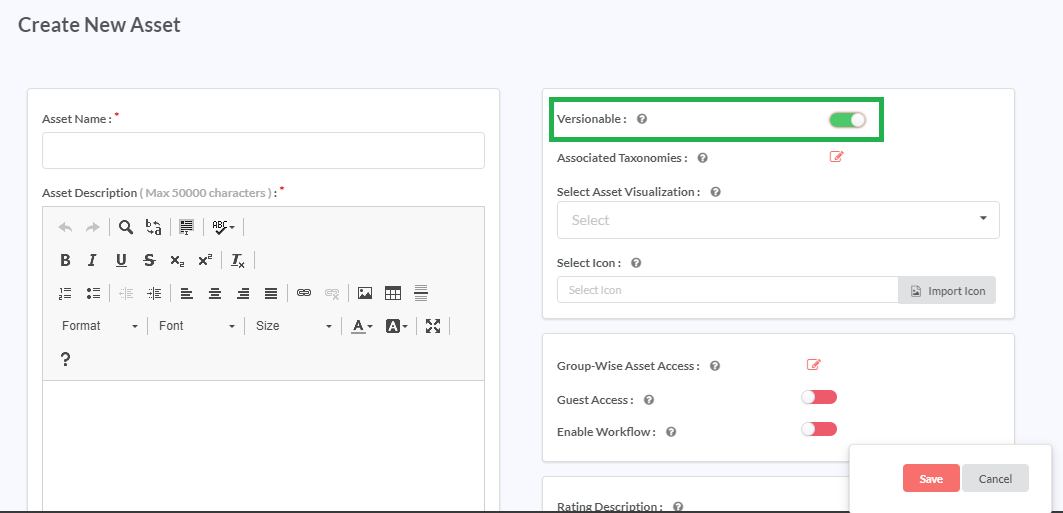
In the Versionable toggler, click and drag the toggler to your right to turn it to green and activate version control for the Asset Type. Inversely, click and drag the toggler to your left to turn it to red and deactivate version control for the Asset Type. To learn more about Versioning, refer: Versioning
In the Associated Taxonomies field, click the Edit icon (
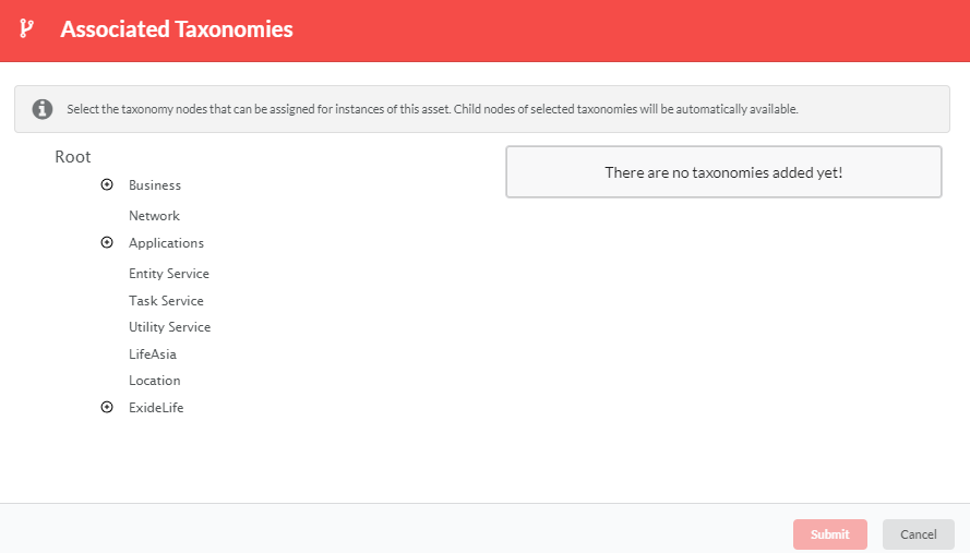
 ) to display the Associated Taxonomies dialog. The Associated Taxonomies dialog displays with the Taxonomy tree.
Navigate the Taxonomy tree and click the Taxonomies that you want to assign to the Asset Type. The selected Taxonomies display in a box on the top-right corner of the dialog.
In the Associated Taxonomies dialog, click Submit to finish assigning the selected Taxonomy(ies) to the Asset Type.
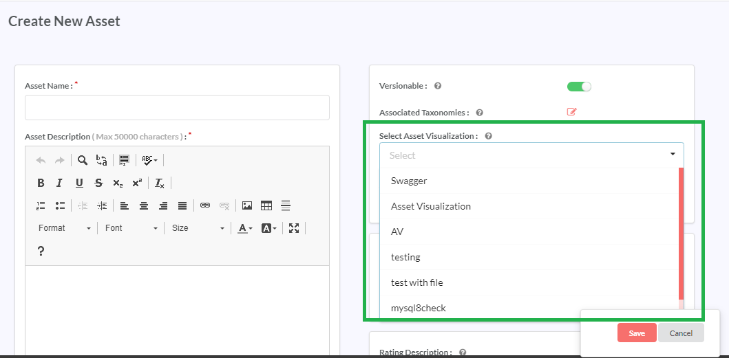
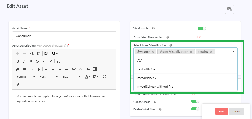
From the Asset Visualization drop-down list, select a Visualization to assign at the asset level. To learn more about Asset Visualization, visit: Asset Visualization at Asset Level.
Note
You need to add the visualization at asset level before you can add it at the instance level.
In the Select Icon field, click Import Icon to select and import an icon file that represents the Asset Type from your computer. The file must be in the PNG, JPG or JPEG format. The file size should be less than 1 MB. The recommended file dimension is 138 x 120 pixels.
In the Access Control section, in the field Group-wise Asset Access, click the Edit icon (
 ) to display the Group-wise Asset Access dialog.
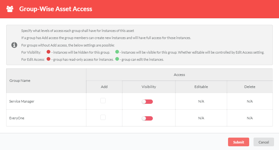
The dialog allows the user to control access to users who can access the Instances created under the Asset Type.
) to display the Group-wise Asset Access dialog.
The dialog allows the user to control access to users who can access the Instances created under the Asset Type.Click to select the levels of access each Group must have for instances of this Asset Type. Add, edit, view, and delete access permissions can be found in respective columns of Add, Visibility, Editable and Delete.
To learn more about how group-wise access control works, refer: Group-wise Asset Access Rights.
To allow add access to a particular Group, click to select the checkbox in the Add column corresponding to the Group that you wish to allow add access. Selecting the Add checkbox disables the controls in Visibility, Editable and Delete columns. This is because if a Group has Add access, it will automatically have view, edit and delete access, and these cannot be disabled.
If you have not allowed add access to a Group:
In the Visibility column, click and drag the toggle to your right to turn it to green (Show status) and allow view access to the group. Inversely, click and drag the toggler to your left to turn it red (Hide status) and disallow view access to the group. If the Visibility has Hide status, the controls in Editable and Delete columns display as not applicable (N/A).
If you have allowed view access to a Group:
- In the Editable column, click and drag the toggler to your right to turn it to green (Edit status) and allow Edit access to the Group. Inversely, click and drag the toggler to your left to turn it to red (Read Only status) to disallow the Group Edit access.
- In the Delete column, click to select the checkbox to allow Delete access to the Group.
Click Submit to save and close the dialog.
To view the available Groups and/or add a new Group(s), refer: Manage Groups.
In the Access Control section, in the field Group-wise Category Access, click the edit icon
 and follow the instructions in the Group-wise Category Access Rights topic below.
Note
The Group-wise Category Access field becomes visible only after a category has been added to the Create New Asset or the Edit Asset screen.
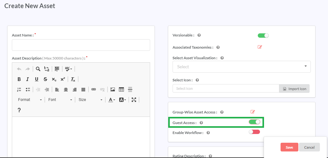
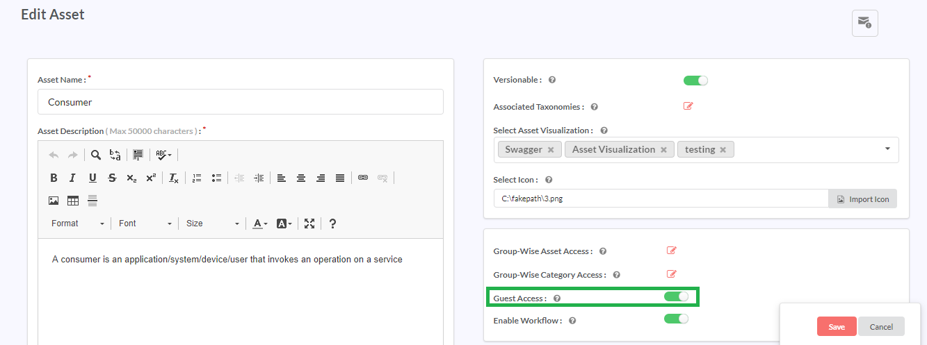
In the Access Control section, in the Guest Access toggler, click and drag the toggler to your right to turn it to green if you wish to allow Guests access to the Asset Type. Inversely, click and drag the toggler to your left to turn it to red and restrict guests access to the Asset Type.
Note
- Restricting the Asset Type, apart from restricting the Guest user access to each Asset Type, does not permit the Guest Users to view the Asset Type for the purposes of browsing and searching through the Browse, Filter and Quick Search options.
- This setting also affects the extent of information provided in the Quick Stats and Recent activity widgets to the Guest Users.
- If Guest Users try to access any of the blocked Asset Types, a page redirect takes them to an Access Denied page.
In the Rating section, in the Rating Description box, provide the text that displays in the Rating and Reviews dialog for the Asset Instance and the quality of its documentation.
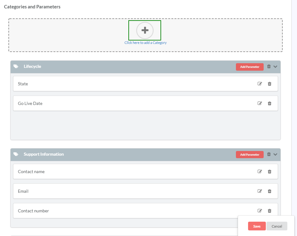
In the Categories and Parameters section, click the Add icon (
 ) to add a Category name to the Asset Type. The Enter Category Name box displays.
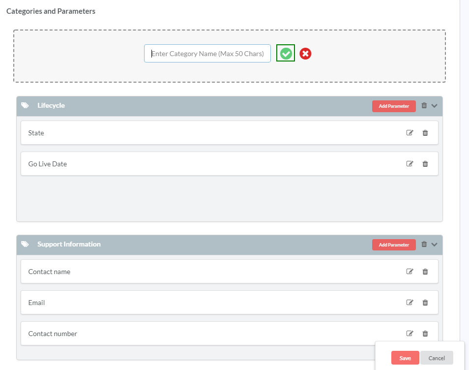
In the Enter Category Name box, type in a name for the category and then click the tick icon (
 ). The added category displays under Categories and Parameters.
Repeat the previous two steps to add more Categories.
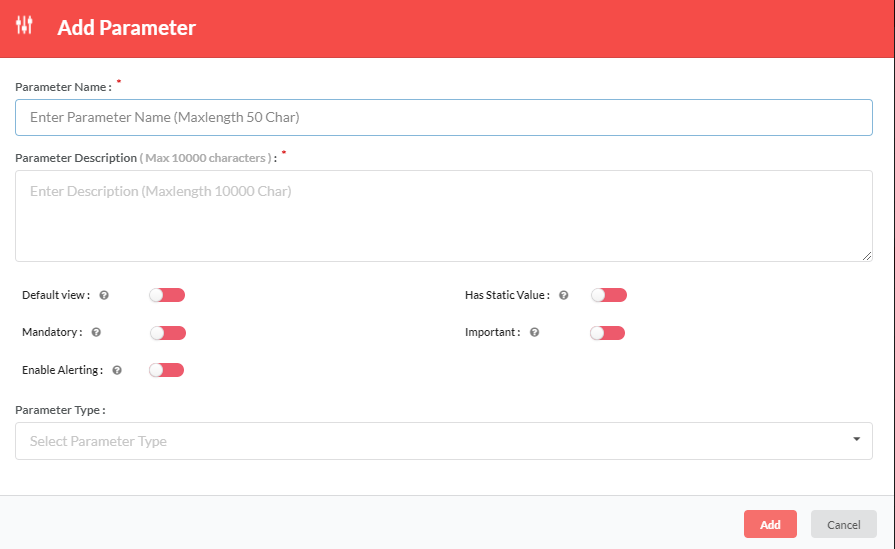
In the header of the newly created category box, click Add Parameter to add a Parameter for the Category. The Add Parameter dialog displays.
In the Parameter Name box, type in a name for the Parameter.
Note
The Parameter Name field can take a maximum length of 50 characters.
In the Parameter Description box, type in the description for the Parameter.
Note
The Parameter Description field can take a maximum length of 10000 characters.
In the Default View toggler, click and drag the toggler to your right (turn it to green) to display the Parameter by default in the Browse <Asset> Instances screen (Asset Instances browse grid). Inversely, click and drag the toggler to your left (turn it to red) to not display the Parameter in the Browse <Asset> Instances screen (Asset Instances browse grid). For more information on Default View, refer: Important, Static, Default View display features.
In the Mandatory toggler, click and drag the toggler to your right (turn it to green) to make the Parameter a mandatory field in the Browse <Asset> Instances screen (Asset Instances browse grid). Inversely, click and drag the toggler to your left (turn it to red) to make the Parameter optional.
In the Has Static Value toggler, click and drag the toggler to your right (turn it to green) to define the Parameter as a static value. Inversely, click and drag the toggler to your left (turn it to red) to define the Parameter as a non-static value. For more information on Static Value, refer: Important, Static, Default View display features.
In the Important toggler, click and drag the toggler to your right (turn it to green) to mark the Parameter as important for gamification purposes. Inversely, click and drag the toggler to your left (turn it to red) to mark the Parameter as not important. For more information on Important Parameter, refer: Important, Static, Default View display features.
In the Enable Alerting toggler, click and drag the toggler to your right (turn it to green) to list this parameter in the Alerting Modal at the instance level. If any rule is set at the instance level, & the user de-selects the Enable Alerting toggler, then the rule that is create at the instance level in the Alerting Modal will be disabled. To find more information on Enable Alerting, visit: Enable Alerting at Instance Level.
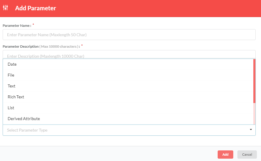
From the Parameter Type drop-down list, select a Parameter Type. The Parameter Types available are: Date, File, Text, Rich Text, List, Derived Attribute, Derived Computation, Derived attribute for an Asset List and LDAP attribute mapping. To find more information on Parameter Types, visit: Properties and Parameter Types.
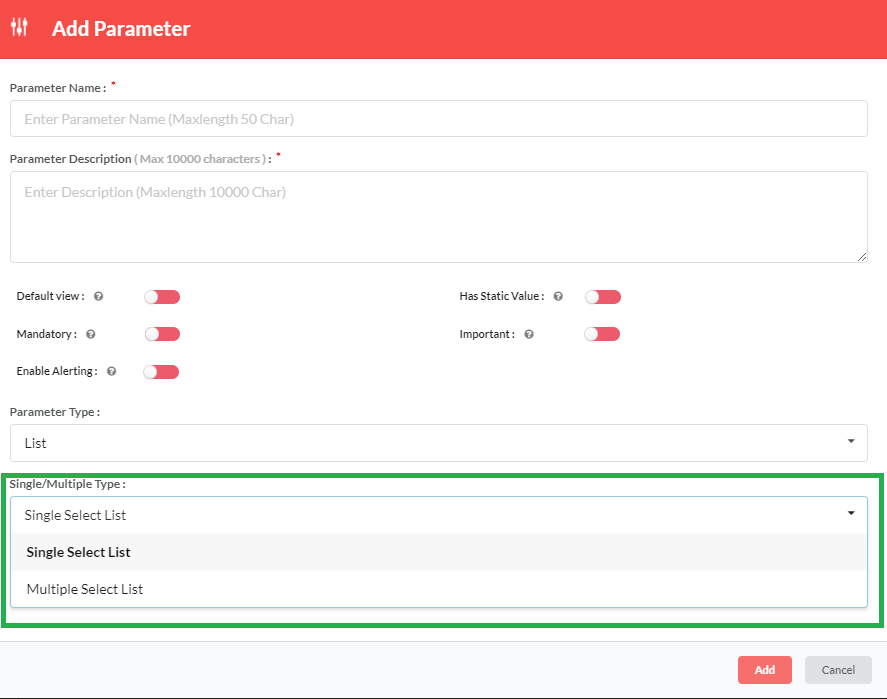
If Parameter Type selected is List, a Single/Multiple Type dropdown displays below. Select Single if you want to allow selection of a single Parameter value from the list. Alternatively, select Multiple to allow selection of multiple values from the list.
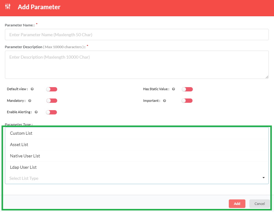
If Parameter Type selected is List, from the List Type dropdown list, select the type of list that has to be used. The options are: Custom List, Asset List, Native User List, Ldap User List. Custom List will have items that the user will provide. Asset List will have items as Asset type that the user can map to the Parameter. Native User List will allow the user to select user(s) from a list of all native users of the application. Ldap User List will allow the user to select user(s) from a list of all LDAP users of the application.
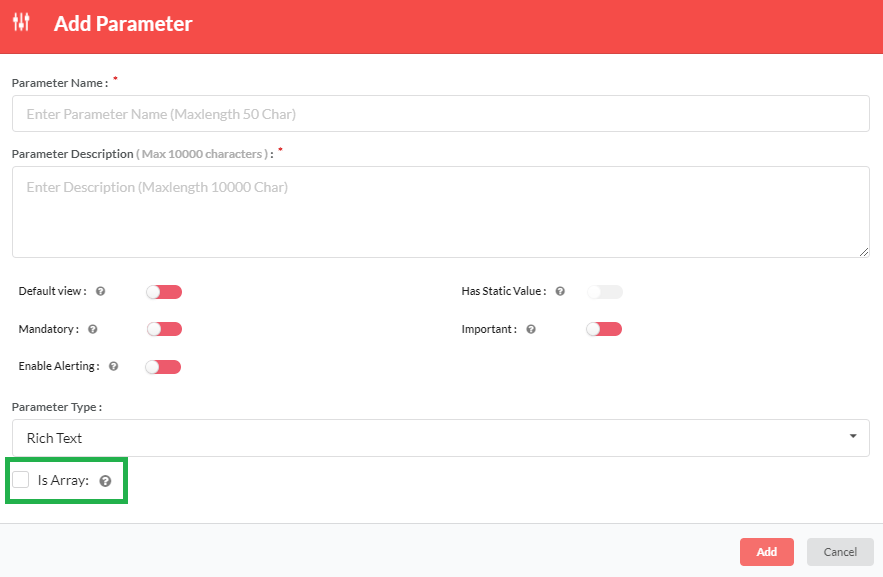
If Parameter Type selected is Text or Rich Text, a Is Array: checkbox displays below. Click to select the Is Array: checkbox if you want to allow users to add multiple values in the Text and Rich Text fields.
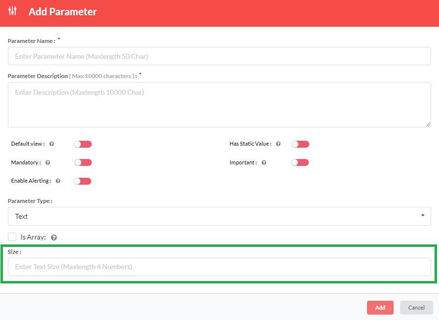
For Text parameter type, in the Size field, type the size of text that is allowed for Text Parameter type.
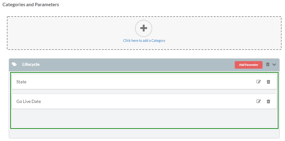
Click Add to save changes and close the Add Parameter dialog. The new parameter displays inside the Category box.
Repeat the previous 8 steps (step 17 to 24) to add more parameters to the Category.
Note
Although any number of categories can be created, RepoPro limits the number of parameters per Category to ten.
Click Save to save changes to the Create New Asset screen and create the new Asset Type.
The following steps allow the user to perform additional tasks while still in the Create New Asset screen:
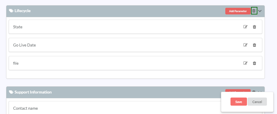
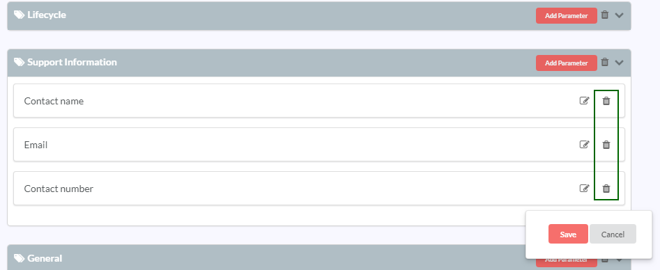
To delete a Category, in the Category box header, click the delete icon (
 ).
).To toggle the collapsed and expanded view for the Category, in the Category box header, click the down arrow icon.
To delete a Parameter, on the Parameter box, click the delete icon (
 ).
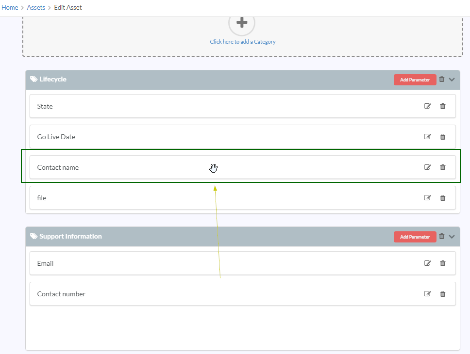
).To allocate/reallocate a parameter to a different category, drag and drop the parameter to the appropriate category. The parameter is added to the category that it is dropped into.
To edit a Parameter, in the Parameter box, click the Edit icon (
 ).
).To edit a Category, click the Category name.
9.2.2. Important, Static, Default View display features
An Admin user has the option to specify whether each Parameter is important (in order to include it in the Gamification calculation - when the user updates important Parameters with values, then that user gets 1 point).
An Asset Type can have a Parameter defined as a static value, which has a single value common to all instances. Whatever is the latest value provided by the user for that parameter in any Asset Instance of the Asset Type is saved, and all Asset Instances reflect the value. The Parameter appears in the View/Edit Asset Instance screen for all the Asset Instances of that Asset Type.
Note
Static Parameter cannot be set as an important Parameter.
The user has the option to specify whether the Parameter appears by default in the View/Edit Asset Instance browse grid (Default View display feature).
Admin users can drag and drop the Categories to reorder them, as also the Parameters within each Category. The order set by the admin user is used for display under Show/Hide Columns dialog box, Browse grid and Create Filter Result grid.
9.2.3. Alerting at Asset Level
Alerting is a method by which users can create notification for rules configured by them. Alerting at Asset Level is a feature that is available only to Super Admin. Super Admin can set rules for other users that will trigger mail notification when that rule set is satisfied.
Client will be provided with an alerting jar. Using Cronjob Scheduler they can run the alerting jar. If the rule defined by the Super Admin is satisfied in the scheduler, a mail notification will be triggered for the users for whom the rule has been set at asset level. More than one user can be assigned to a rule at a time.
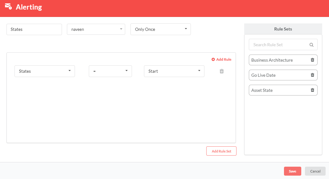
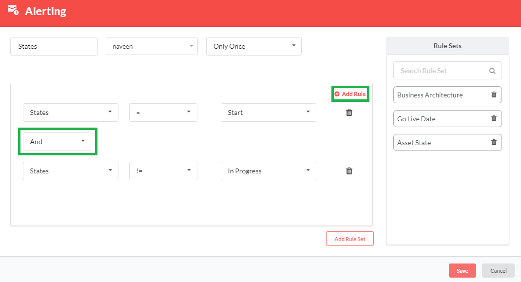
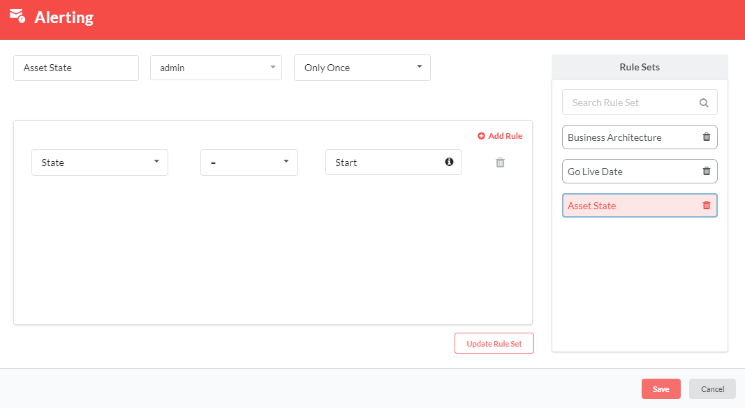
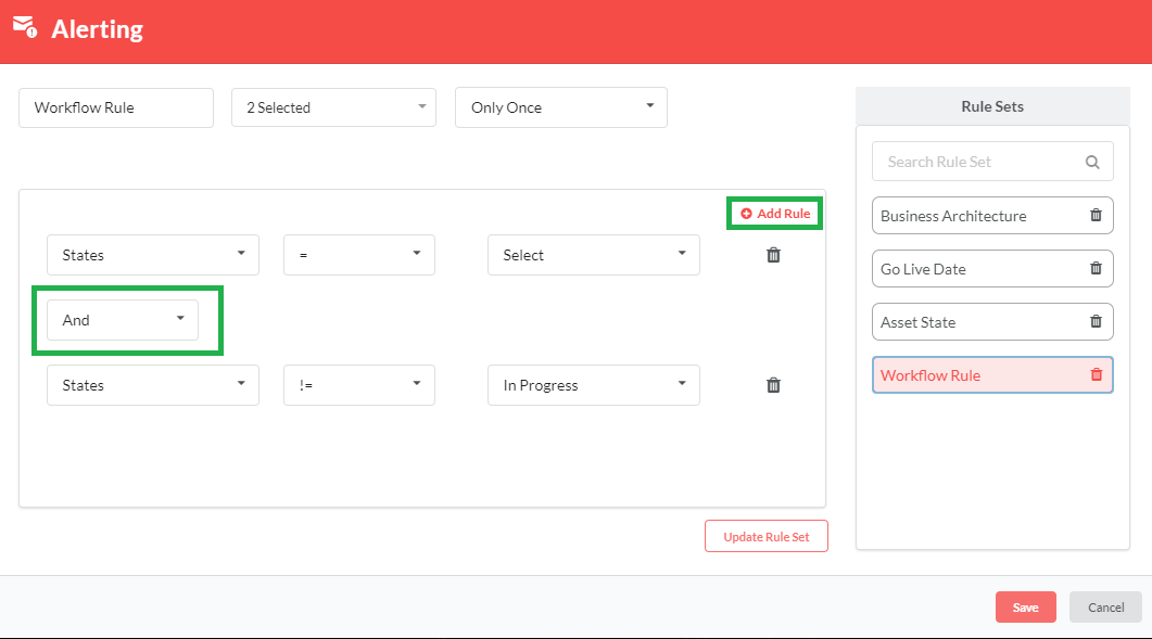
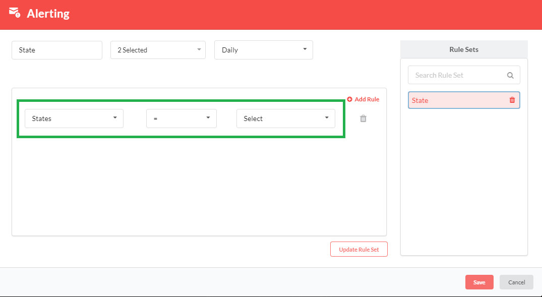
Super Admin can create more than one rule and club them together under a Rule Set. Only the users for whom the rule set has been created will receive the notification. Additonally, Super Admin can create notifications for users when they need to be notified of a change in workflow state. For example, when there is a state change from Start → InProgress, a rule can be set for the particular instance for which the workflow is defined for a user.
To set alerting at Asset Level:
- In the main Navigation menu, click Administer > Information Modeling > Manage Assets. The Assets screen displays listing all the created Asset Types.
- To edit an Asset Type, in the Assets screen, click the Edit icon (
 ) in the Edit column.
Note
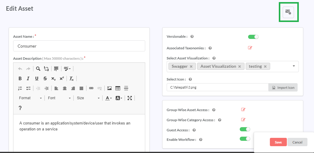
Alerting modal option is present only in the Edit Asset page and not Create New Asset page.
To set the rule of the parameter for an Asset level, click the ![]() icon as highlighted in figure.
icon as highlighted in figure.
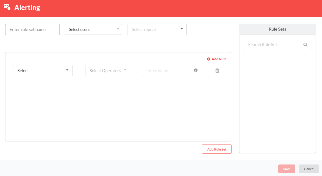
On clicking the ![]() icon Alerting modal page will be displayed.
icon Alerting modal page will be displayed.
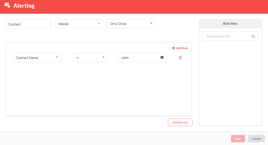
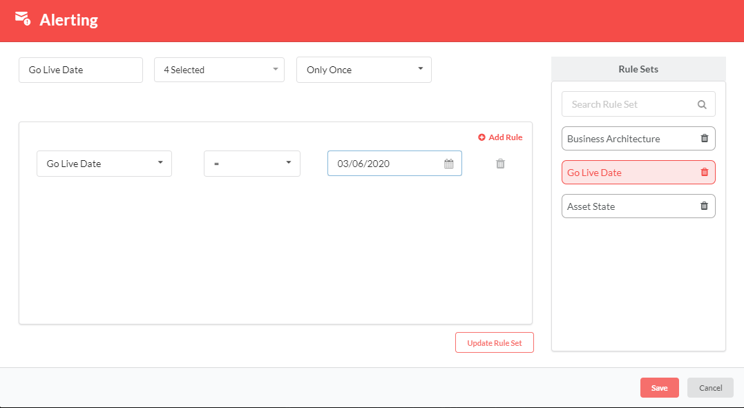
Alerting Modal for Creating a New Rule Set:
- Populate the below mandatory fields with the required values:
- Enter rule set name: Enter the name to be assigned to the rule set in this text box.
- Select users: This drop-down displays the list of active users that can be assigned the rule set for that particular asset. More than one user can be selected using the check-boxes. You can also search for the required user using the Search Users search box.
Note
It is mandatory for the Super Admin to select at least one user. If a user is selected and if the same user is then made inactive, then that user will be shown as disabled in the Select users drop-down list and email notifications will not be sent to that user.
- Select repeat: This drop-down displays the frequency at which the user will be notified. The available options are: None, Only Once, Hourly, Daily, Weekly, Monthly and Yearly. Depending on the Select Repeat option, user will receive notification accordingly.
- Select: This drop-down displays list of parameters and the state as two options where the user can set the rule when they need to be notified. When only one rule is present, the delete icon is disabled.
- Select Operators: This drop-down displays list of all operators allowed for the type of parameter selected.
The allowed list of operators for respective field is listed below
Table 9.1 List of Operators¶ Field Operator Date =, !=, <, >, <=, >= Text =, !=, <, >, <=, >= Rich Text like, not like, =, != List - Array List, Custom List, User List, Ldap User List =, != LDAP Mapping like, not like, =, != Derived Attributes (DA) like, not like, =, != Derived Computation (DC) =, != Derived attribute for asset list (AC) like, not like, =, != State =, !=
Enter Value: Enter the value to be assigned to the parameter. Except for Date and State parameters, if parameter type value consists of /, in the enter value textbox, then that will be considered as multiple values. Use /, as a separator while entering multiple values.
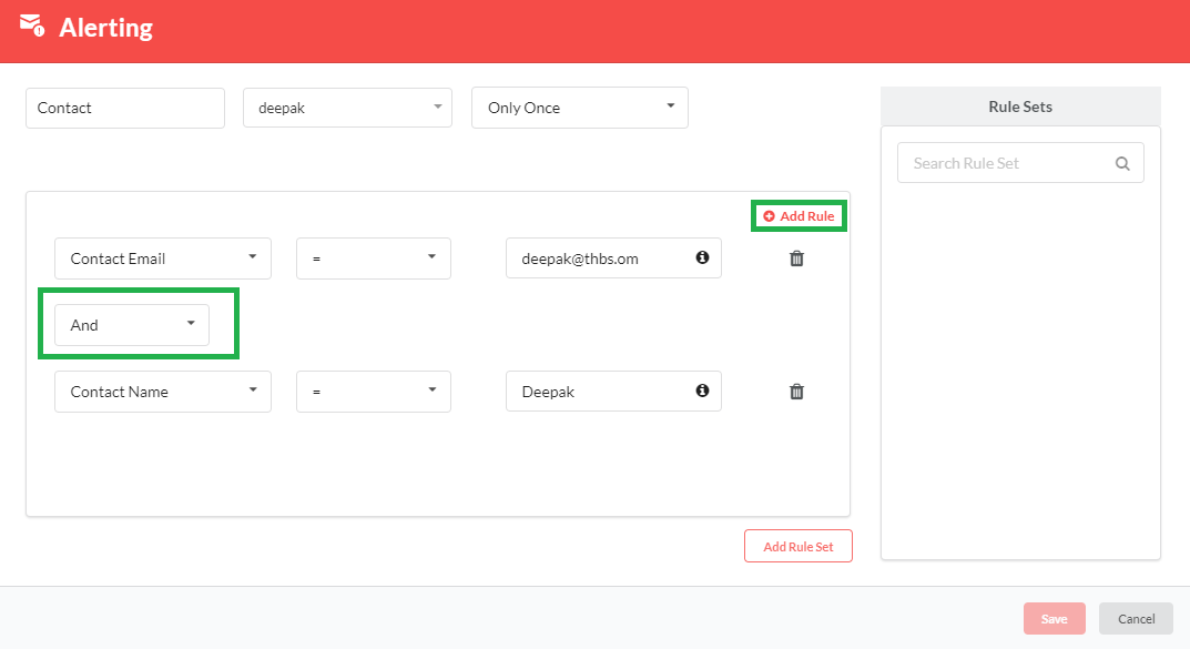
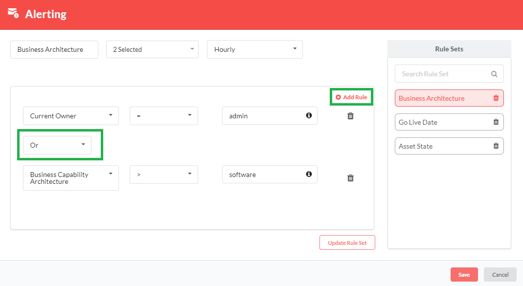
A rule set can be either be a single rule or a combination of multiple rules. Multiple rules are combined using the logical operators And/Or.
Click Add Rule. A drop-down appears where you can select either And or Or to add multiple parameter-value rule combinations for a single rule set.
Click Add Rule Set. The rule set displays under the Rule Sets column. To search for a particular rule set, type the required rule set name in the Search Rule Set search bar. You can delete the parameter rule set by clicking the delete (
 ) icon corresponding to each rule set. While deleting, the system will ask for confirmation. If the Admin clicks Yes, the rule set will be deleted.
Click Save to save the changes or click Cancel to exit without saving.
Alerting JAR will be provided to the user. The user runs the jar using CronJob Scheduler. If the rule is matched with the parameter value defined at the asset level, the notification will be sent to the user for whom the rule set has been created.
Notification message pattern that is sent via email is: <RuleSet Name> has met the rule for <asset Instance Name> of the <Asset Name>.
Alerting Modal for Editing an Existing Rule Set
- Under the Rule Sets column, click the rule set whose details you want to modify. The rule set with its details will be displayed.
- You can edit the values for the below fields:
- Enter rule set name: Edit the name to be assigned to the rule set in this text box.
- Select users: Edit the list of users that can be assigned the rule set for that particular asset. More than one user can be selected using the check-boxes. You can also search for the user using the Search Users search box.
Note
It is mandatory for the Super Admin to select at least one user. If a user is selected and if the same user is then made inactive, then that user will be shown as disabled in the Select users drop-down list and email notifications will not be sent to that user
Select repeat: Edit the frequency at which the user will be notified. Depending on the Select Repeat option, user will receive notification accordingly. The available options are: None, Only Once, Hourly, Daily, Weekly, Monthly and Yearly.
Select: This drop-down displays list of parameters and the state as two options where the user can set the rule when they need to be notified. When only one rule is present, the delete icon is disabled.
Select Operators: Edit list of all operators allowed for the type of parameter selected. The allowed list of operators for respective field is same as those mentioned in Alerting Modal for Creating a New Rule Set section.
Enter Value: Edit the value to be assigned to the parameter. Except for Date and State parameters, if parameter type value consists of /, in the enter value textbox, then that will be considered as multiple values. Use /, as a separator while entering multiple values.
A rule set can be either be a single rule or a combination of multiple rules. Multiple rules are combined using the logical operators And/Or.
Click Add Rule. A drop-down appears where you can select either And or Or to add multiple parameter-value rule combinations for a single rule set.
Click Update Rule Set to save the updated data. The rule set displays under the Rule Sets column. To search for a particular rule set, type the required rule set name in the Search Rule Set search bar. You can delete the parameter rules or parameter rule set by clicking the delete (
 ) icon corresponding to each rule/rule set. While deleting, the system will ask for confirmation. If the user clicks Yes, the rule/rule set will be deleted.
Click Save to save the changes or click Cancel to exit without saving.
When a rule set is defined and saved using ‘States’ parameter, and if that state name is renamed or deleted from Manage Workflow, then in alerting dialog box, in the Select drop-down, default value i.e. Select will be shown when rule details are displayed.
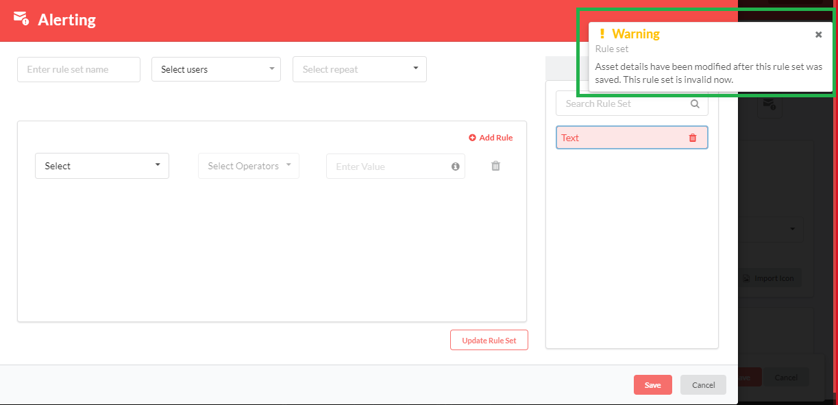
When a rule set is defined and saved for a parameter, and if that parameter is deleted from the parameter list, then in the alerting dialog box, when you click that rule set, a warning message is displayed. You can either delete this rule set or update the values within this rule set.
Alerting JAR will be provided to the user. The user runs the jar using CronJob Scheduler. If the rule is matched with the parameter value defined at the asset level, the notification will be sent to the user for whom the rule/rule set has been created.
Notification message pattern that is sent via email is: <RuleSet Name> has met the rule for <asset Instance Name> of the <Asset Name>.
Note
When a Super Admin wants to re-create the rule, then the existing rule need to be deleted if it is in disabled mode and create a new rule.
9.2.4. Asset Visualization at Asset Level
Asset visualizations are created in the Manage Asset Visualization page. To find more information on creating a visualization, visit: Manage Asset Visualization.
Once the user has created a visualization, they can then assign the same to an asset by selecting from the Asset Visualization drop-down list on the Manage Asset page. The options available in the Asset Visualization drop-down list will depend on the number of visualizations created in the Manage Asset Visualization page. The visualization selected on the Manage Asset page will be reflected under the Asset Visualization section on the Asset Instance details page. For more details, refer: Asset Visualization at Instance Level.
You can assign more than one type of visualization to an asset. Select the required visualizations from the drop-down list. The selected visualizations will be appear above the drop-down and the same can be removed by clicking the cross icon ![]() .
.
Click Save to save the changes.
Note
You need to assign the visualization at asset level before you can display it at the instance level.
9.2.5. Workflow at the Asset Level
Workflow is a sequential pattern of activity. If Enable Workflow is activated, the user can create the workflow. Workflow can be defined and managed by the admins, and can have one-one, one-many, many-one states.
9.2.5.1. Enable Workflow
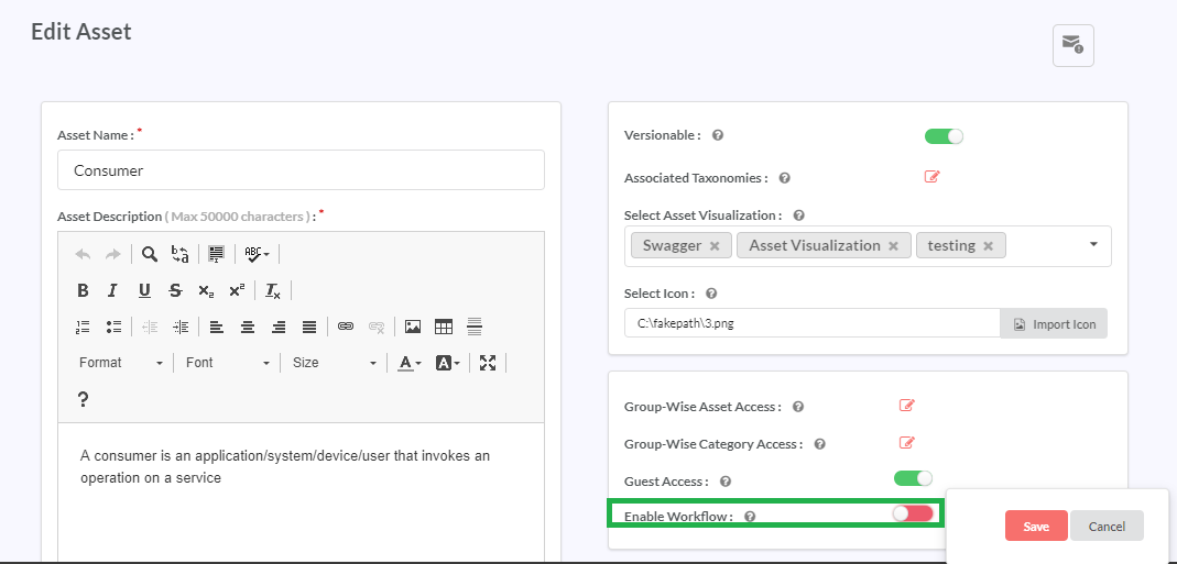
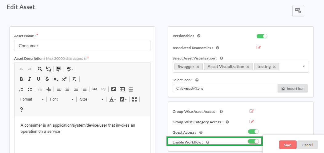
To enable the workflow, user must navigate to Administer > Information Modelling > Manage Assets. Screen gives a grid-view of all the Asset Types created in the repository. It displays the Asset Types in an alphabetical order. On selecting an Asset, edit page opens, where user can find an Enable Workflow. User can select the workflow if any of the assets needs to follow the defined workflow defined by the user, or the Enable workflow toggler will be de-selected.
States of Enable workflow
Case 1: If the Enable Workflow is De-selected.
The Enable Workflow is de-selected then the toggler will be red. The asset cannot follow any workflow created by the admin if Enable Workflow is de-selected.
Case 2: When the Enable Workflow is Selected and Asset not assigned
When the Enable Workflow is selected then toggler is in green, then following action can be performed:
If Enable Workflow is selected then that asset can follow the workflow. To assign an asset to the workflow, please refer: Manage Workflow section.
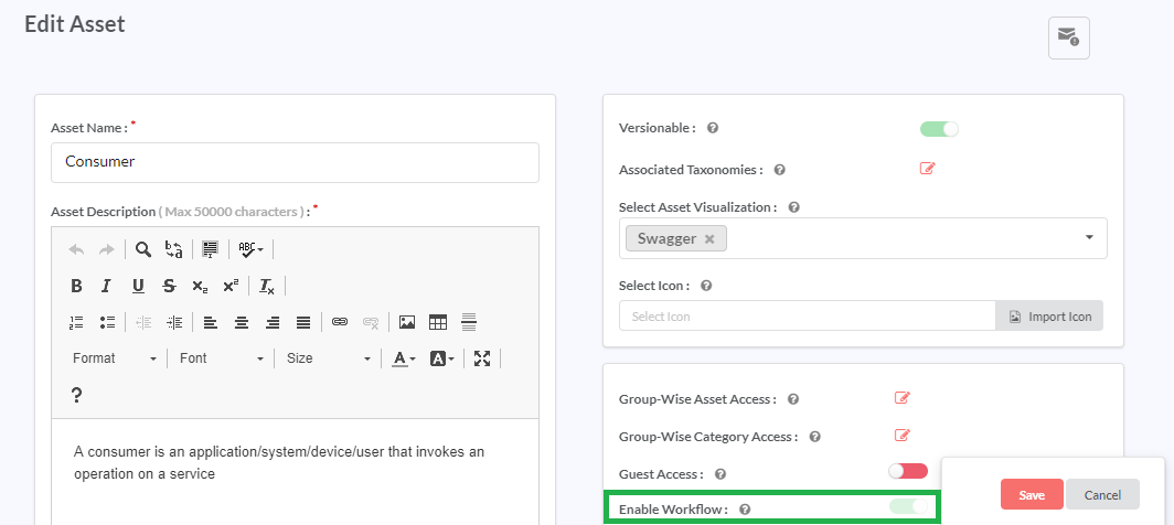
If an asset is assigned to the workflow, user cannot de-select the Enable Workflow toggle, as this will be shown in the disabled mode.
Case 3: When the Enable Workflow is selected and workflow is defined for the asset.
Enable Workflow will be in green and will be in disabled state. Then following action can be performed:
When the asset is assigned to a workflow the Enable Workflow toggle button will be disabled until the asset is removed from the workflow.
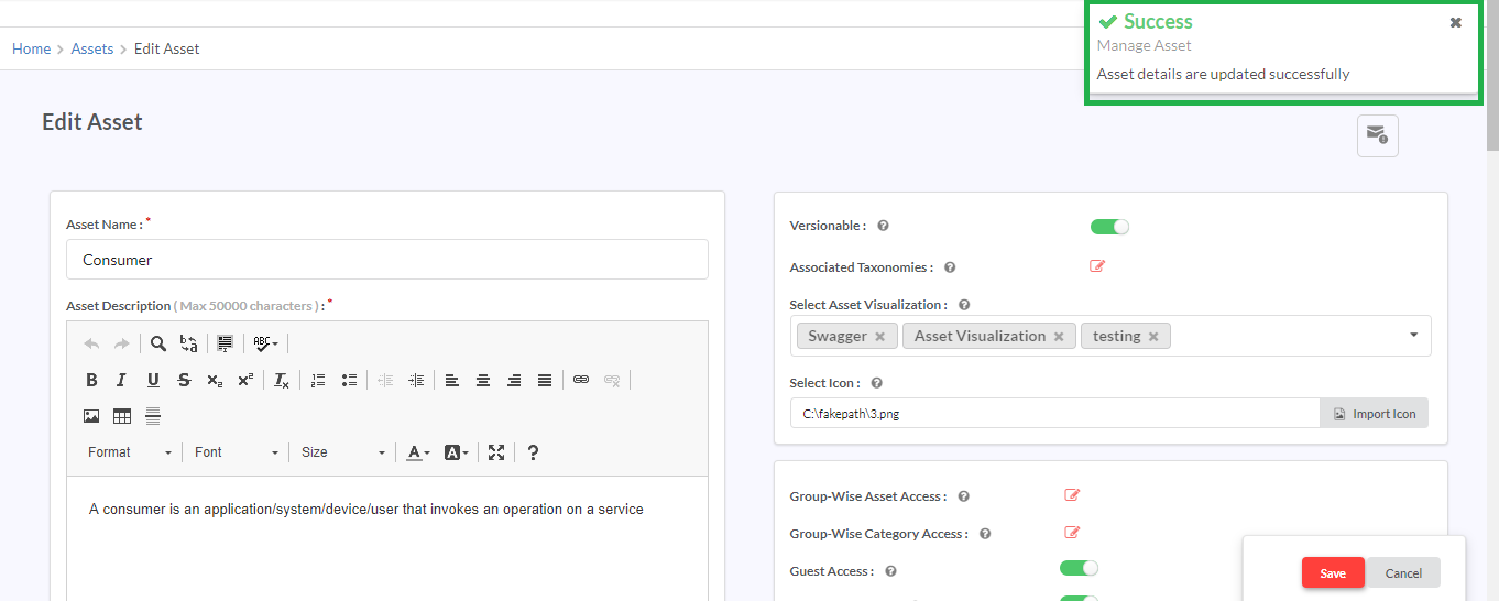
Once the changes are made, click on Save to save the changes. A success message displays.
Note
- At a time, only one workflow can be defined for an asset.
- One workflow can be defined for multiple assets.
- If an asset is assigned to a workflow then that workflow cannot be deleted.
- User cannot disable the workflow at the Manage Asset page.
9.2.6. Delete Asset Types
Deleting an Asset Type deletes the following from the Repository:
- the Asset Type and all the Asset Instances under that Asset Types.
- all the Relationships defined for the Asset Type.
- all the instantiations of the Relationships between Asset Instances.
To delete an Asset Type:
In the main navigation menu, click Administer > Information Modeling > Manage Assets to display the Assets screen.
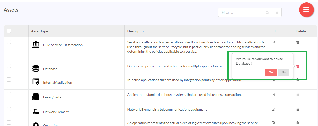
In the Assets list, click the delete icon (
 ) in the row that has the Asset Type you wish to delete. A pop-up displays
Or select the checkbox corresponding to the Asset Name you wish to delete, then click the Hamburger menu (
 ) and then click the (
 ) delete icon. You can also delete all the types of the asset by selecting the checkbox corresponding to the Asset Name in the header row.
A Delete Assets dialog box displays.
Click Yes to delete the asset.
Note
You cannot delete an asset that is mapped with a parameter.
9.2.7. Group-wise Category Access Rights
RepoPro allows the user to configure the access rights at the group-level to each Category in an Asset Type.
To control Group-wise access to a Category:
In the main Navigation menu, click Administer > Information Modeling > Manage Assets to display the Assets screen.
In the Assets list, click the Edit icon (
 ) for the Asset for which you wish to change the Category access rights for Groups.
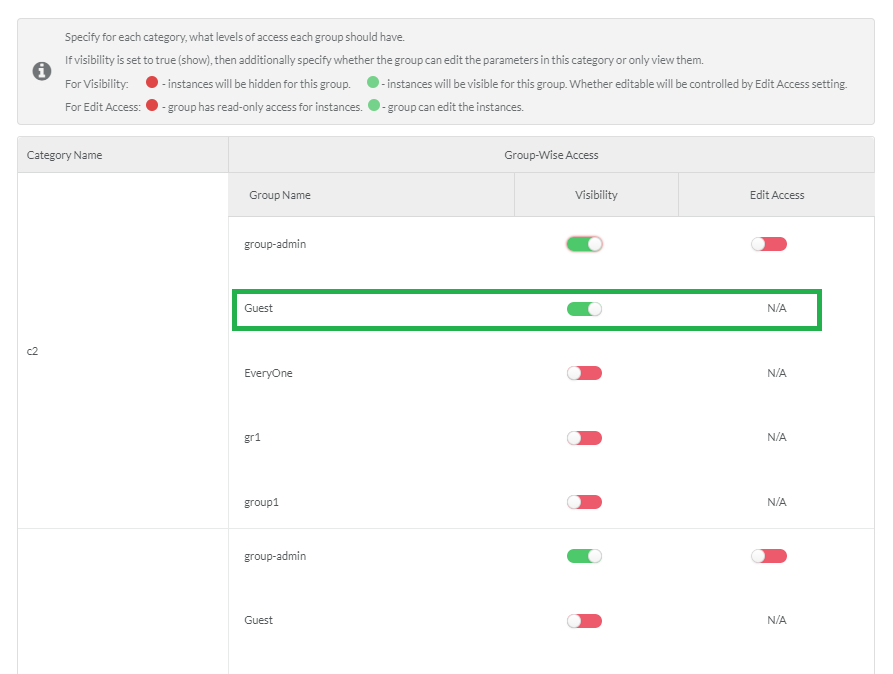
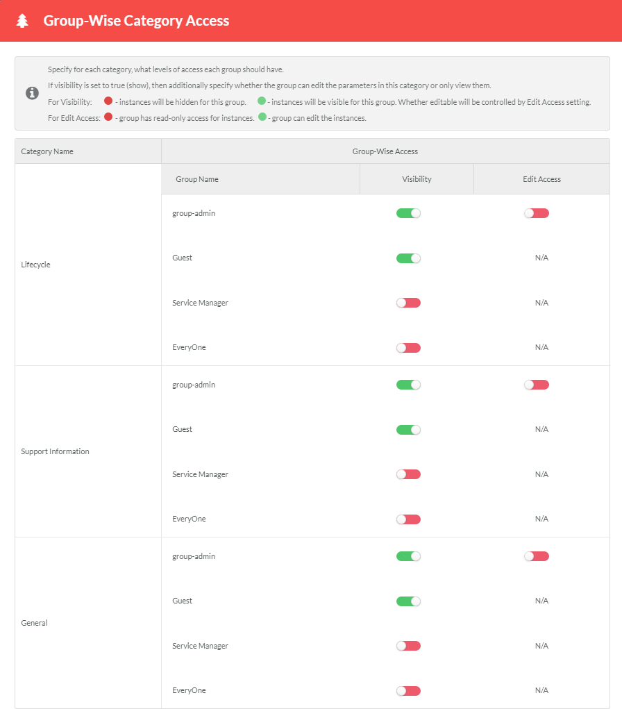
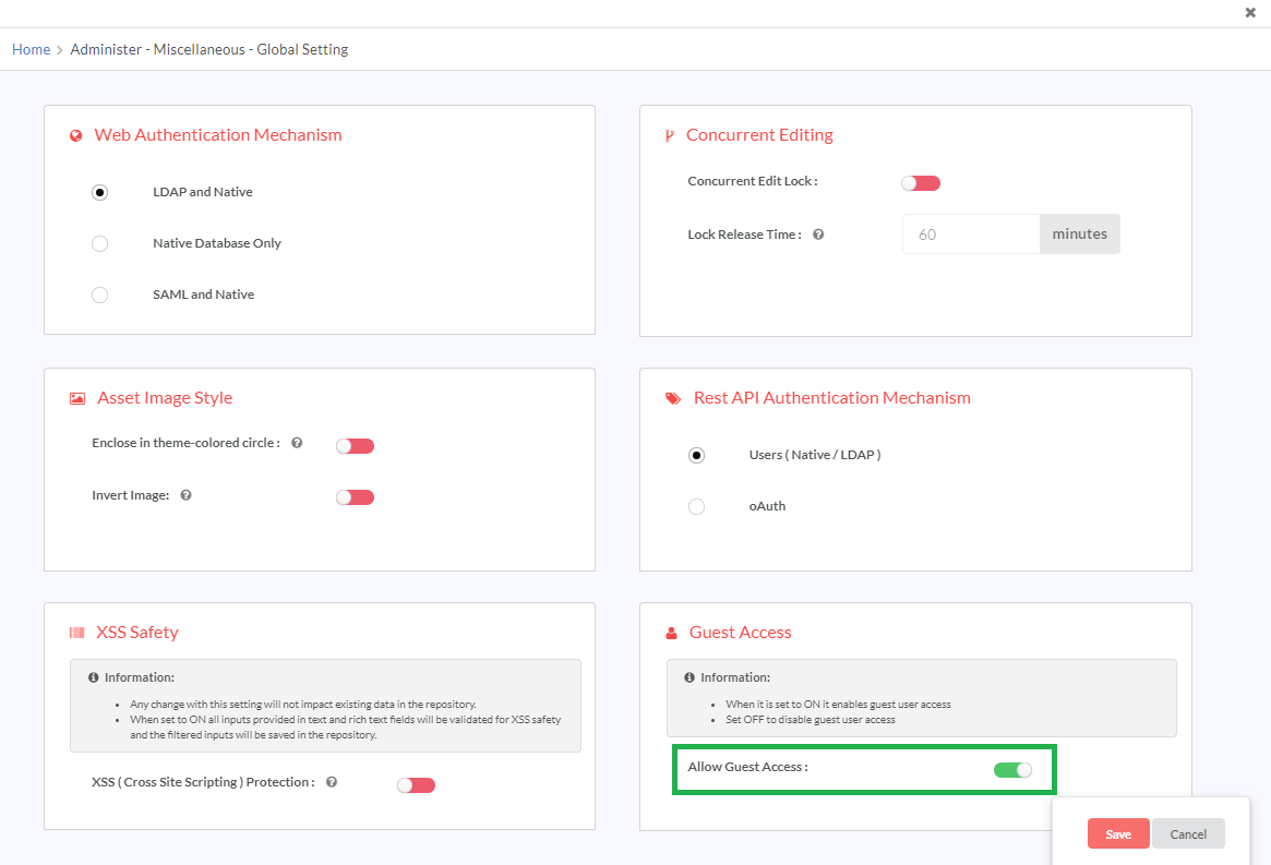
In the Edit Asset screen, in the Access Control section, in Group-Wise Category Access, click Edit to display the Group-Wise Category Access dialog. The dialog lists all the Categories under the Asset and the available Group Names against each. It includes a Group called Guest to manage the category access for non-logged-in users also. To enable the Guest Group, super admin users must first enable the Guest Access option in the Global Settings page. To do this, follow the steps (1-3) listed in Guest Access.
If the Guest Access option in the Global Settings page is disabled, the Guest Group will not be displayed to users.
By default, when a Category is created, the Group admin has view access to the Category as is represented by the Show status in the Visibility column against the Group-admin group.
In the Visibility column, for the Category for which you wish to control View access, click and drag the toggler to your right to turn it to green (Show status), and allow view access to the Group. Inversely, click and drag the toggler to your left to turn it to red (Hide status), and hide the Category from the Group.
If you have allowed View access you can additionally configure whether a group only has a read-only access or gets full edit permission to the category.
To control edit permissions allowed for a category, in the Edit Access column, click and drag the toggler to your right to turn it to green (Edit status) for the corresponding Group for which you wish to allow Edit access. Inversely, click and drag the toggler to your left to turn it to red (Read-Only status) and allow only Read-only access to the Group.
When rendering Asset Instance pages, RepoPro takes into account individual asset instance’s access settings for the Group. Users can only view those categories for which their Group has access permissions. If the Group to which the user belongs does not allow access to the Asset Instance itself as per the instance-level settings, the instance does not get rendered at all.
Click Submit to save changes and close the dialog.
The user(s) belonging the Group that has the access to the Category(ies) as selected in the Category-wise access can now view and edit the corresponding Category(ies).
9.2.8. Guest Access (Edit Asset)
The Guest Access feature in the Edit Asset page lets users show/hide the asset from Guest users. Guest Access option is only displayed if the super admin user has enabled the Guest Access option in the Global Settings page. To do this, follow the steps (1-3) listed in Guest Access. Once the Guest Access option in the Global Settings page is enabled, you will see the Guest Access option in the Edit Asset page.
To control guest access permissions, in the Edit Asset page, for the Guest Access option, click and drag the toggler to your right to turn it to green. The asset will be visible to Guest users. Inversely, click and drag the toggler to your left to turn it to red to hide the asset from Guest users.
If the Guest Access option in the Global Settings page is disabled, the Guest Access option in the Edit Asset page will not be displayed to users.
9.2.9. Group-wise Asset Access Rights
RepoPro allows users to manage access at group-level for adding, viewing, editing and deleting Asset Instances for each Asset Type.
If a User Group has ‘Add’ access permission, it automatically also has view, edit and ‘Delete’ access. Therefore, the user cannot change the visibility, editable and delete controls in the Group-wise Asset Access dialog after selecting the Add checkbox.
If a User Group does not have ‘Add’ access, RepoPro checks to verify whether it has view access. If view access indicated by the Visibility toggler is in the ‘Hide’ state, then that Group will not have edit or delete access for that asset.
If a group does not have ‘Add’ access but has ‘View’ access, then the user can configure whether it has read-only access or edit access (as indicated by the Editable toggler), and whether it has Delete access.
9.3. Manage Taxonomies
RepoPro allows the classification of Asset Instances through the use of scientifically defined Taxonomies. Users can define and modify the Taxonomy tree as part of Information Modeling.
9.3.1. Add/Edit/Delete Taxonomies
To add Taxonomies using the Taxonomy Tree:
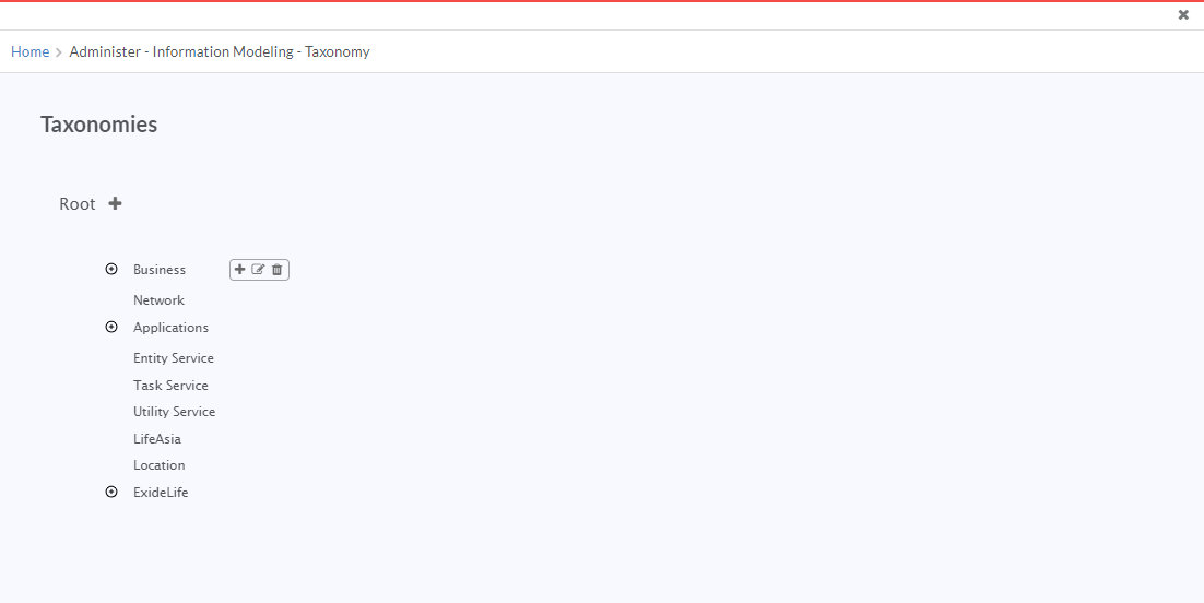
In the main Navigation menu, click Administer > Information Modeling > Manage Taxonomies. The Taxonomies screen displays. The Taxonomies screen provides a tree-view of the Taxonomies with Root as its first entry. The user can create any number of branches and sub-branches to the Root.
Hover over any Taxonomy node and click the Add icon (
 ) to add a child-node to the node.
Click the Edit icon (
 ) to edit the node
Click the Delete icon (
 ) to delete the node.
Note
Deleting a node that has child nodes results in deletion of all its children.
The user can expand/collapse a node to display the nesting of children below, except in the case of the Root.
For instructions on assigning or unassigning Taxonomies to individual Asset Instance, visit: Add or Edit an Asset Type.
9.4. Manage Relationships
RepoPro allows its users to define internal dependencies between Assets as Relationships. Users can create Relationships between Asset Types based on composition, association, aggregation, and classification of Asset Types with associated semantics.
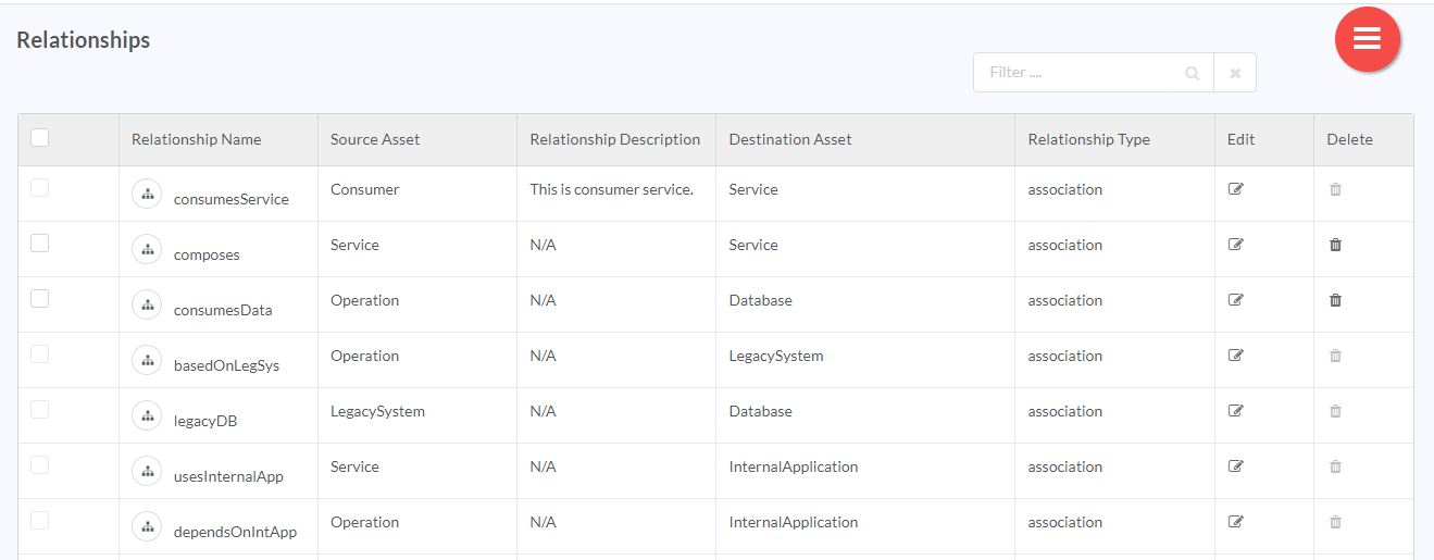
Options to add, edit and delete Relationships is available from the Relationships screen, which has a grid containing all the defined Relationships. Users can also visualize Relationships between Instances in both forward and backward directions.
9.4.1. Add a Relationship
To add a new Relationship:
In the main Navigation menu, click Administer > Information Modeling > Manage Relationships. The Relationships screen displays.
Click the Hamburger menu (
 ) and then click Add icon (
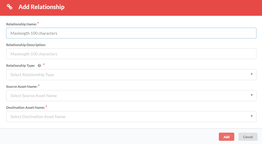
 ) to display the Add Relationship dialog.
In the Relationship Name box, type in the name of the Relationship that you wish to create.
In the Relationship Description box, type a description for the Asset Instance. You can enter a maximum of up to 100 characters. Any change made to the Relationship Description here will be reflected in the Relationship Description box in Relationship tree. Refer To add description to the Relationship tree: under Relationships for details.
In the Relationship Type drop-down list, click to select the Relationship Type from the available options: composition, association, aggregation, classification. To learn more about Relationship Types, refer: Asset Relationships.
In the Source Asset Name drop-down list, click to select the Asset Type that forms the source of the Relationship.
In the Destination Asset Name drop-down list, click to select the Asset Type that forms the destination of the Relationship.
Click Add to create the Relationship.
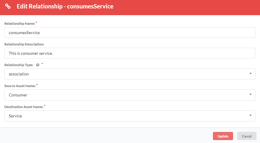
9.4.2. Edit a Relationship
To edit a Relationship:
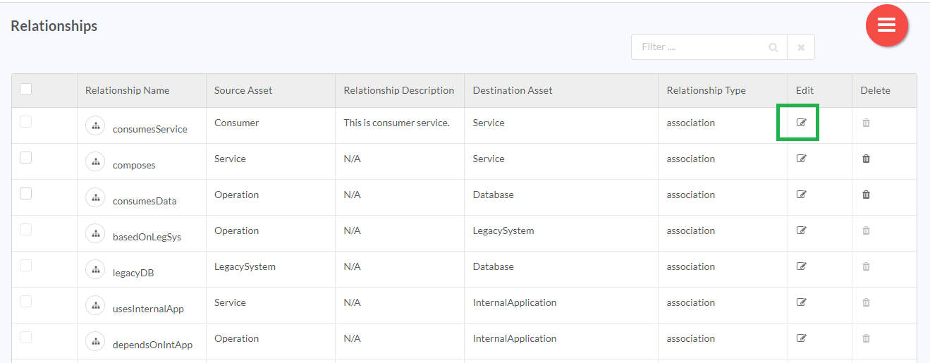
- In the List of Relationships grid, in the row that has the Relationship you wish to edit, click the edit icon (
 ).
).
- In the Edit Relationships dialog, click Update after making the required changes to save changes and close the dialog.
Rules associated with editing a Relationship:
- If Asset Instances already instantiate this Relationship, none of the details can be changed.
- Relationship can be renamed provided the new name is unique.
- The details can be edited subject to the rules mentioned for add Relationship section above.
9.4.3. Delete a Relationship
To delete an existing Relationship:
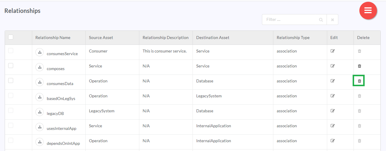
- In the List of Relationships grid, in the Delete column, click the delete icon (
 ) in the corresponding row to delete the Relationship.
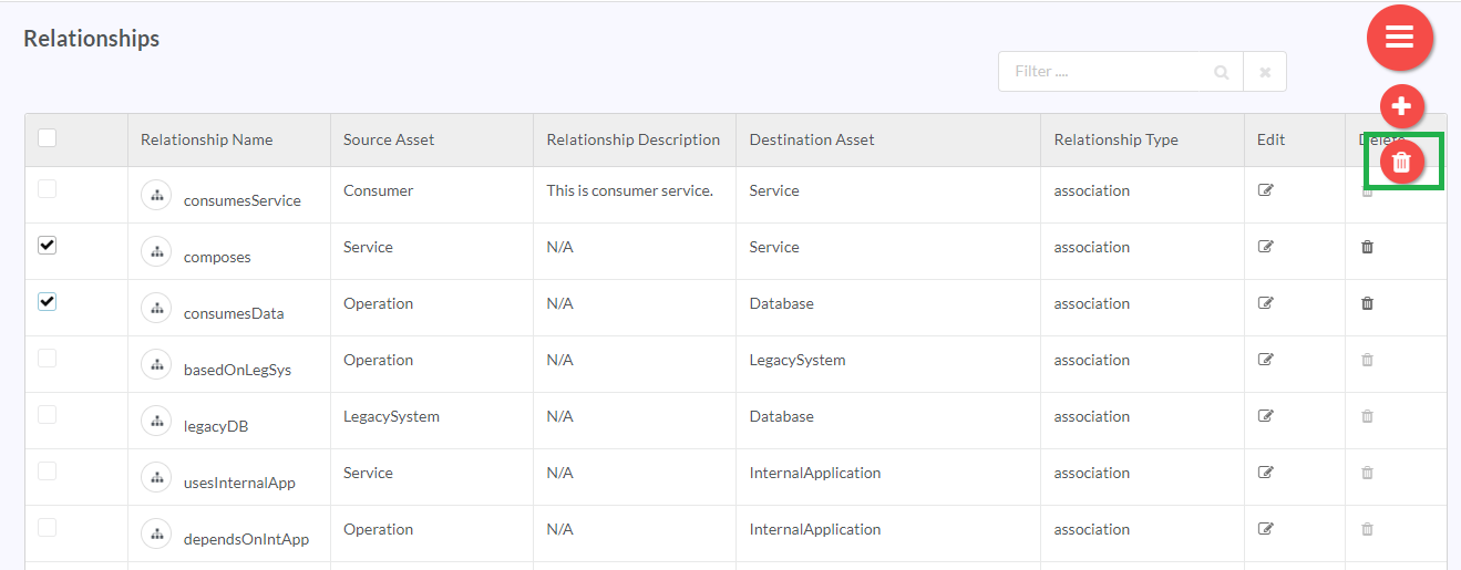
Or select the checkbox corresponding to the Relationship Name you wish to delete, then click the Hamburger menu (
 ) and finally click the (
 ) delete icon. You can also delete all the types of the relationships by selecting the checkbox corresponding to the Relationship Name in the header row.
Note
If Instance level Relationship exists then you cannot delete the relationship.
9.4.4. Using the Filter option
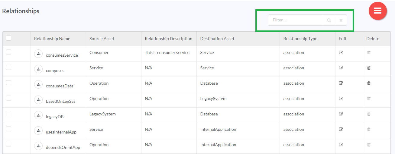
RepoPro allows the user to weed out Relationships from a huge list of Relationships using its filter option present on the Relationships screen.
To use the filter, in the Filter box, type the keywords you wish to use for narrowing down the results. The Relationships screen updates with fresh results based on the typed keyword(s).
9.5. Manage Asset Visualization
Asset visualization feature in RepoPro helps users define the way they want to see the asset within an organization. Users can create any number of asset visualizations, and the visualizations can be associated with multiple assets. Once the visualization is created, the user must assign it to asset from the Manage Asset page, and then display it at the instance level from the Asset Instance Details page.
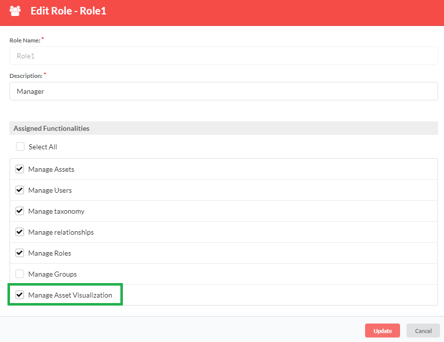
In order to make asset visualization feature available to other users, the Admin must first enable the Manage Asset Visualization option in the Edit Roles section.
Note
Only Admin can select/deselect the Manage Asset Visualization option in the Edit Role dialog.
The Manage Asset Visualization screen provides an infinite scroll view. While scrolling downwards, a scroll icon appears. Click the scroll icon  to be re-directed to the top of the screen.
9.5.1. Add a Visualization
To add a visualization:
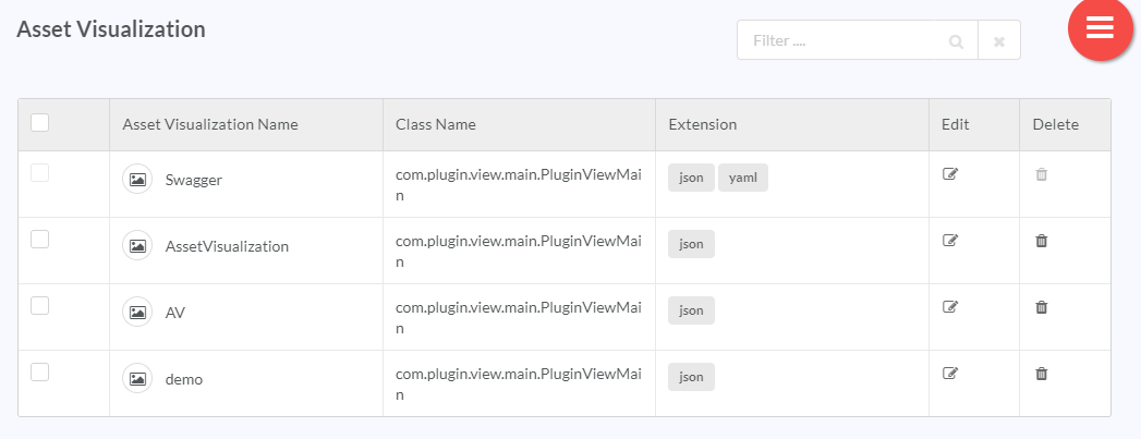
- In the main Navigation menu, click the Administer > Information Modelling > Manage Asset Visualization. The Asset Visualization screen displays the list of already created visualizations.
Note
The asset visualization (named Swagger) at the top of the list is created for user reference. Users can refer to this sample while creating their visualization. This asset visualization sample cannot be deleted.
- In the Asset Visualization screen, click the Hamburger menu (
 ) and then click the Add icon (
 ) to create a new visualization.
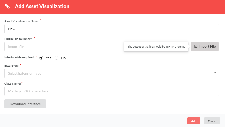
- In the Asset Visualization Name box, type in a name for the visualization you wish to create.
- In the Plugin File to Import box, click Import File to choose a file in jar format to import from your computer.
Note
- RepoPro currently supports Swagger Plugin.
- You can only upload a jar file in the Plugin File to Import box. Jar file automatically converts the code in json/yaml file into html format that will be displayed in the Asset Instance Details page.
- In the Interface file required radio button option, click to select Yes or No. If Yes is selected, Upload file option will be available in the Asset Instance Details page. If No is selected, Upload file option will not be available, but instead, the visualization will be displayed by default in the Asset Instance Details page.
- In the Extension box, select the type of extension from the drop-down list. At present, RepoPro supports two types of extensions: JSON and YAML. This option will only be available if Interface file required radio button option is selected as Yes.
- In the Class Name box, type in the standard class name.
- Click Download Interface to download the interface for your reference.
Note
Same interface can be used for both the cases whether Interface file required option is yes or no, wherein null pointer validation should be handled in jar if Interface file required option is selected as No.
- Click Add to complete creating a new visualization. A success message displays if the visualization is added successfully.
Once the visualization is created, the user must assign it to the asset from the Manage Asset page, and then view it at the instance level from the Asset Instance Details page. For information on how to assign visualization at asset level, Asset Visualization at Asset Level. To know how to display asset visualization at instance level, Asset Visualization at Instance Level.
9.5.2. Edit a Visualization
You can make modifications to a visualization that you have created. The Edit (![]() ) option allows you to make changes to the information that you had entered while creating an asset visualization.
) option allows you to make changes to the information that you had entered while creating an asset visualization.
To edit a visualization:
- In the main Navigation menu, click the Administer > Information Modelling > Manage Asset Visualization. The Asset Visualization page displays the list of already created visualizations.
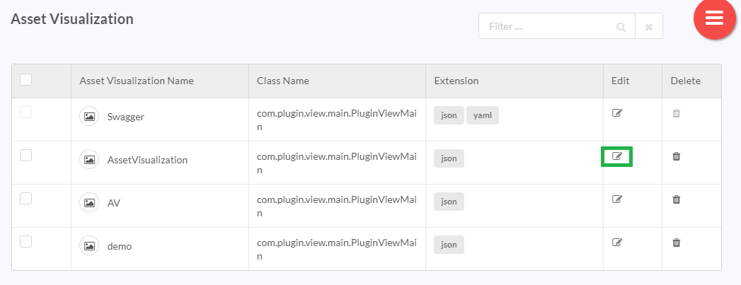
- On the Asset Visualizations page, in the Edit Column, click the Edit icon (
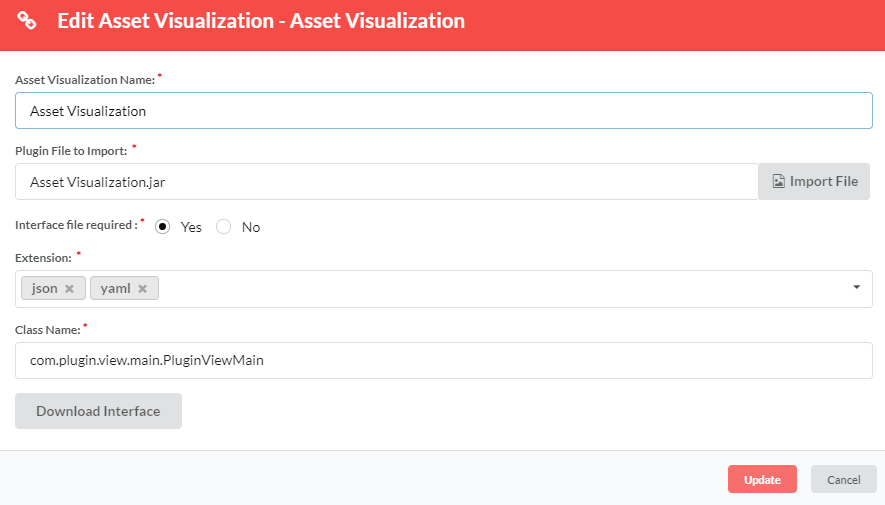
 ) in the row that has the visualization name that you wish to edit. The Edit Asset Visualization dialog displays.
- Make the necessary changes and click Update. A success message displays if the visualization details are updated successfully.
9.5.3. Delete a Visualization
To delete a visualization:
- In the main Navigation menu, click Administer > Information Modelling > Manage Asset Visualization. The Asset Visualization screen displays the list of already created visualizations.
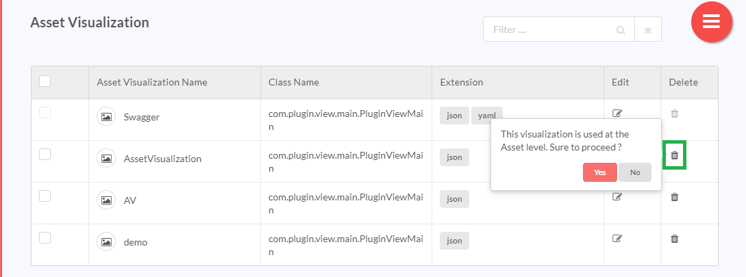
- In the Delete column, in the row that has the visualization you wish to delete, click the delete icon (
 ). A pop up message displays asking you to confirm the action.
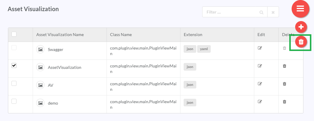
Or select the checkbox corresponding to the Asset Visualization Name you wish to delete, then click the Hamburger menu (
 ) and then click the (
 ) delete icon.
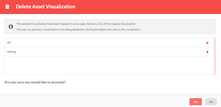
You can also delete all the types of the asset visualizations by selecting the checkbox corresponding to the Asset Visualization Name in the header row. A notification displays. If the list has mapped visualizations, then the Delete Asset Visualization dialog box displays the list of mapped visualizations.
Note
You can prevent a mapped visualization from being deleted by clicking the delete icon ![]() next to the visualizations.
next to the visualizations.
- Click Yes to proceed. A success message displays if the visualization is deleted successfully.
Note
User will not be able to delete the sample asset visualization.
9.5.4. Using the Filter option
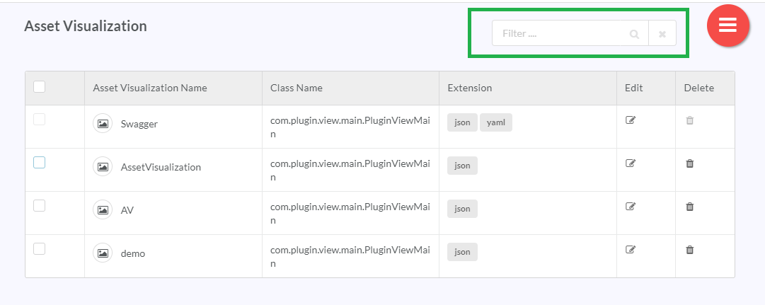
RepoPro allows the user to filter out asset visualization results from the available asset visualization grid using its “Filter” option present on the Manage Asset Visualization screen. It also allows you to filter results based on all or selective asset visualization attributes.
To use the filter, in the Filter box, type the keywords you wish to use for narrowing down the results. The Manage Asset Visualization screen updates with fresh results based on the typed keyword(s).
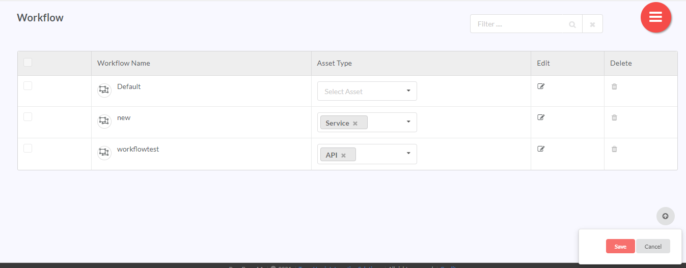
9.6. Manage Workflow
A workflow is a sequence of tasks that occur in a particular order. It can include any number of steps. Workflows in RepoPro can be assigned to different asset types. Each asset type can have only a single workflow associated with it.
A user must assign a workflow to an asset for the workflow to be functional. Once the workflow is assigned to an asset, the workflow state will be displayed at the instance level from the Asset Instance Details page.
The Manage Workflow screen provides an infinite scroll view. While scrolling downwards, a scroll icon appears. Click the scroll icon  to be re-directed to the top of the screen.
9.6.1. Add a Workflow
To add a new workflow:
- In the main Navigation menu, click the Administer > Information Modelling > Manage Workflow. The Manage Workflow screen displays the list of already created workflows.
Note
The workflow (named Default) at the top of the list is created for user reference. Users can refer to this sample while creating their workflow. This workflow sample cannot be deleted.
- On the Manage Workflow page, click the Hamburger menu (
 ) and then click the Add icon (
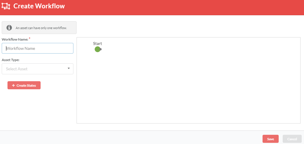
 ) to create a new workflow. The Create Workflow page displays.
- In the Workflow Name box, type in a name for the workflow you wish to create.
Note
- Workflow name is a mandatory field.
- Workflow name must be Unique and mandatory with a maximum of 50-character length.
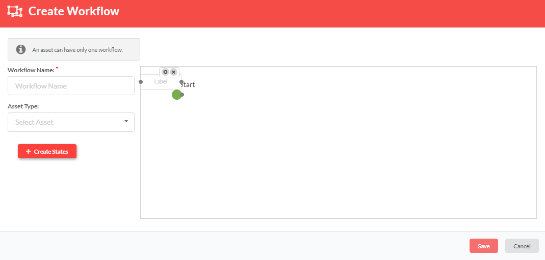
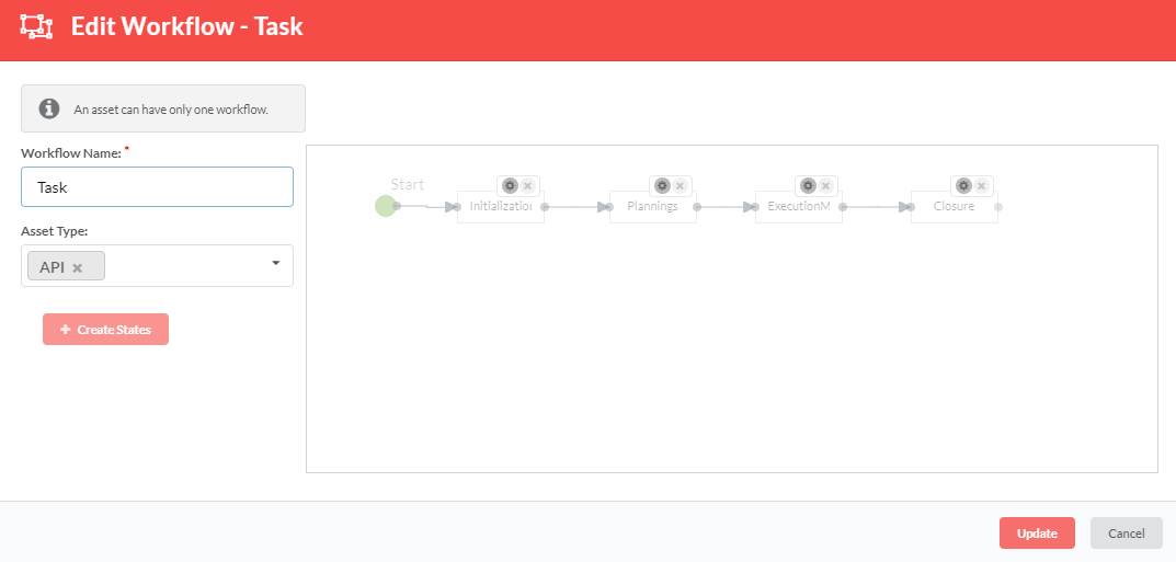
- To create a workflow, click Create States. A label box will be created for you to enter a state name.
- Click Create States each time to add more states.
Click the
icon corresponding to a state to delete that state.
Click the
icon corresponding to a state to add API details to that state. For details on how to add API details, refer: Add API Details to a Workflow State.
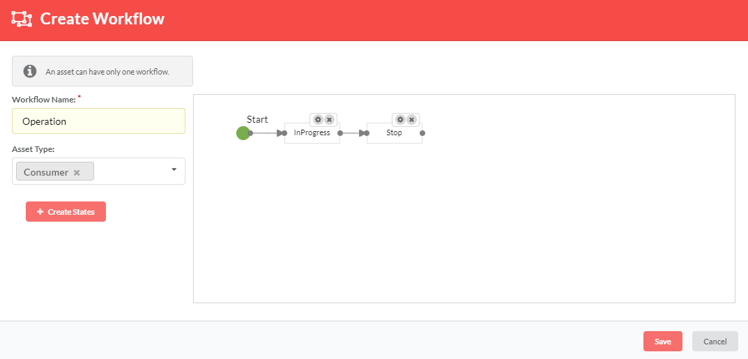
Use the connectors to connect the endpoints between states and create a workflow as shown below.
Note
- State names should be unique.
- User can have One-One, One-Many, Many-One states.
- Click Save to save the workflow.
Note
- A Label can be repositioned anywhere in the right pane.
- User can add any number of labels.
- Asset will follow the workflow once assigned.
9.6.1.1. Add an Asset to a Workflow
To add an asset to a workflow
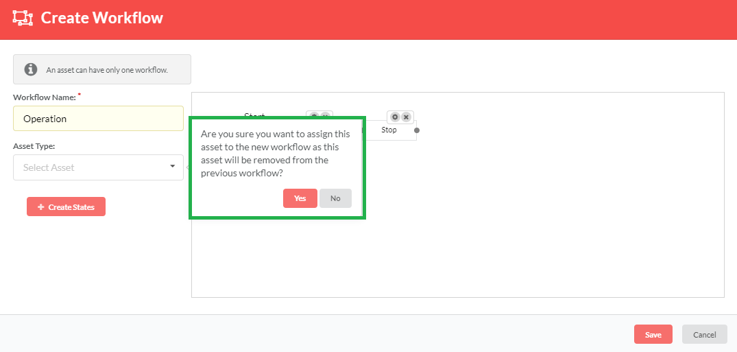
On the Create Workflow page, from the the Asset Type drop-down list, select the required asset from the list of assets.
Note
An asset can have only one workflow.
- Click Save to save the workflow details.
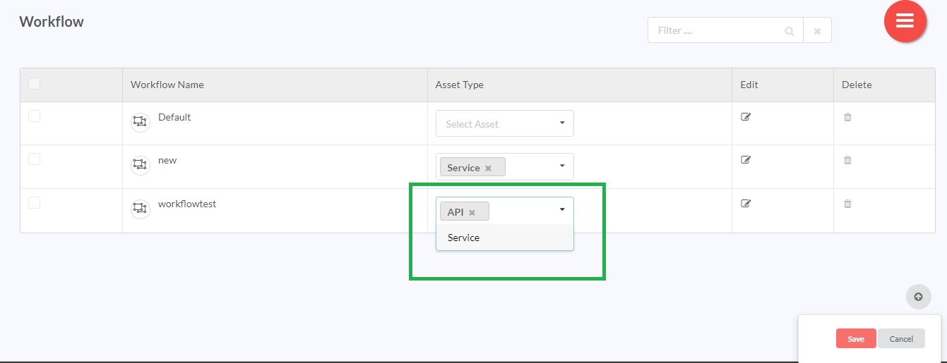
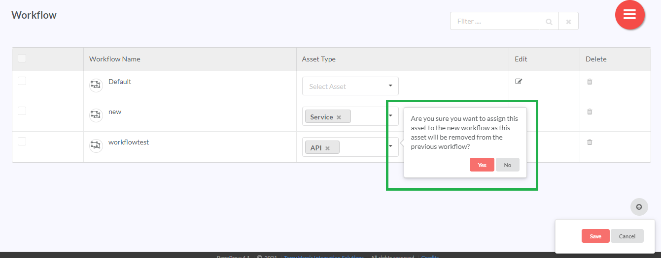
You can also add an asset from the Manage Workflow page.
On the Manage Workflow page, from the the Asset Type drop-down list, select the required asset from the list of assets.
- Click Save to save the workflow details.
9.6.1.2. Delete an asset from a Workflow
To delete an asset from a workflow:
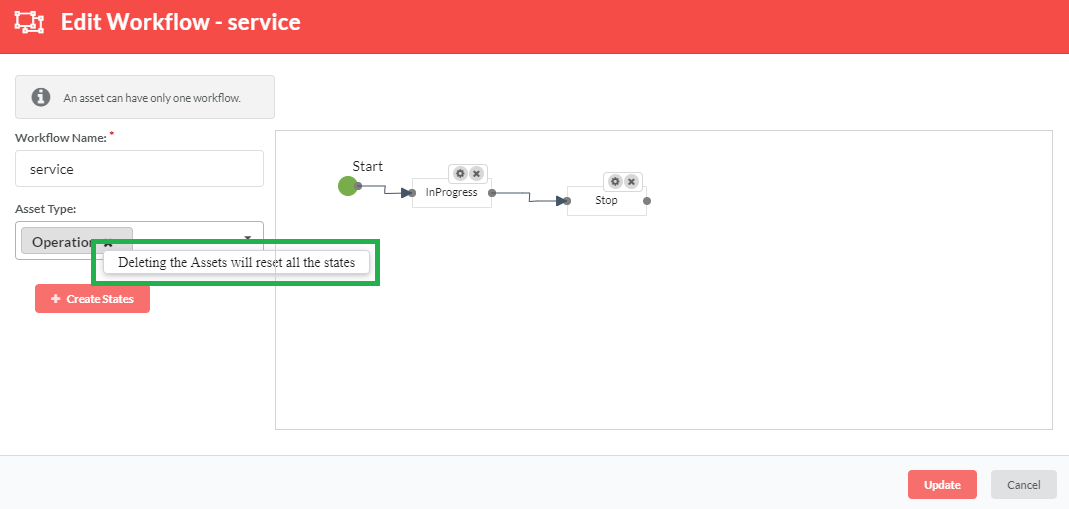
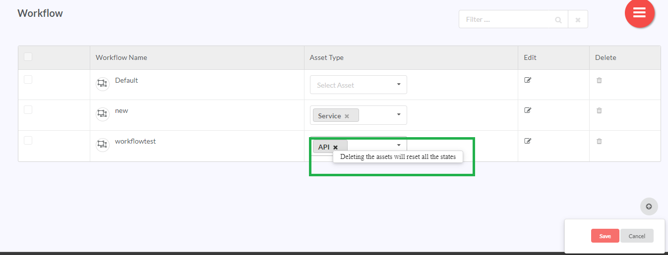
- On the Edit Workflow page, from the the Asset Type drop-down list, hover over the (
 ) icon of the required asset to delete it. A message displays as shown below.
- Click (
 ) icon to remove the asset from the list.
 - Click Save to update the workflow details. All the states of the asset will be reset.
You can also add an asset from the Manage Workflow page.
- On the Manage Workflow page, from the the Asset Type drop-down list, select the required asset from the list of assets.
- Click (
 ) icon to remove the asset from the list.
 - Click Save to update the workflow details. All the states of the asset will be reset.
9.6.2. Edit a Workflow
To edit a workflow:
- In the main Navigation menu, click the Administer > Information Modelling > Manage Workflow. The Manage Workflow page displays the list of already created workflows.
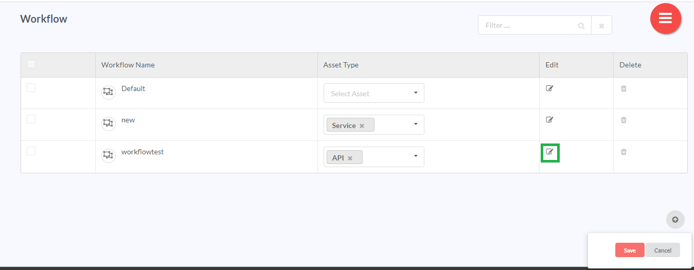
- On the Manage Workflow page, click the edit icon (
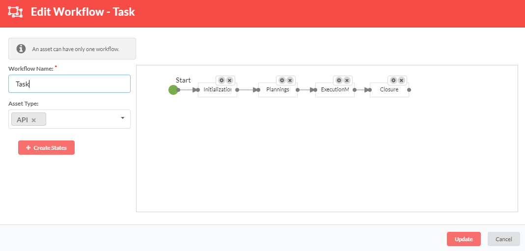
 ) corresponding to the required workflow. The Edit Workflow page of that particular workflow displays.
Make the necessary changes.
Use (
 ) icon to edit API details (refer: Edit API Details for a Workflow State) and (
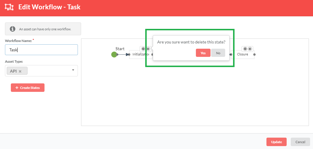
 ) icon to delete the state.
When you click the (
 ) icon, a message displays as shown below. Click Yes to delete the state.
Click Update and then click Save to save the changes. A success message displays if the workflow details are updated successfully.
The changes will be applicable to all instances of the asset for which the workflow is defined. But when the state of any instance associated with this workflow is changed, the workflow defined for that instance will be disabled. You will no longer be able to add states or make changes to the existing states. But you will be able to add/edit API details even if the workflow is disabled. For details on how to add and edit API details, refer sections: Add API Details to a Workflow State and Edit API Details for a Workflow State respectively.
9.6.3. Delete a Workflow
To delete a workflow:
- In the main Navigation menu, click Administer > Information Modelling > Manage Workflow. The Asset Visualization screen displays the list of already created workflows.
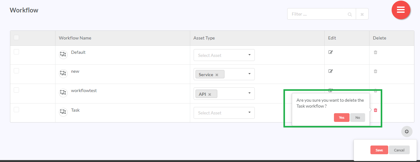
- On the Manage Workflow page, click the delete icon (
 ) corresponding to the required workflow. A message displays asking you to confirm the action.
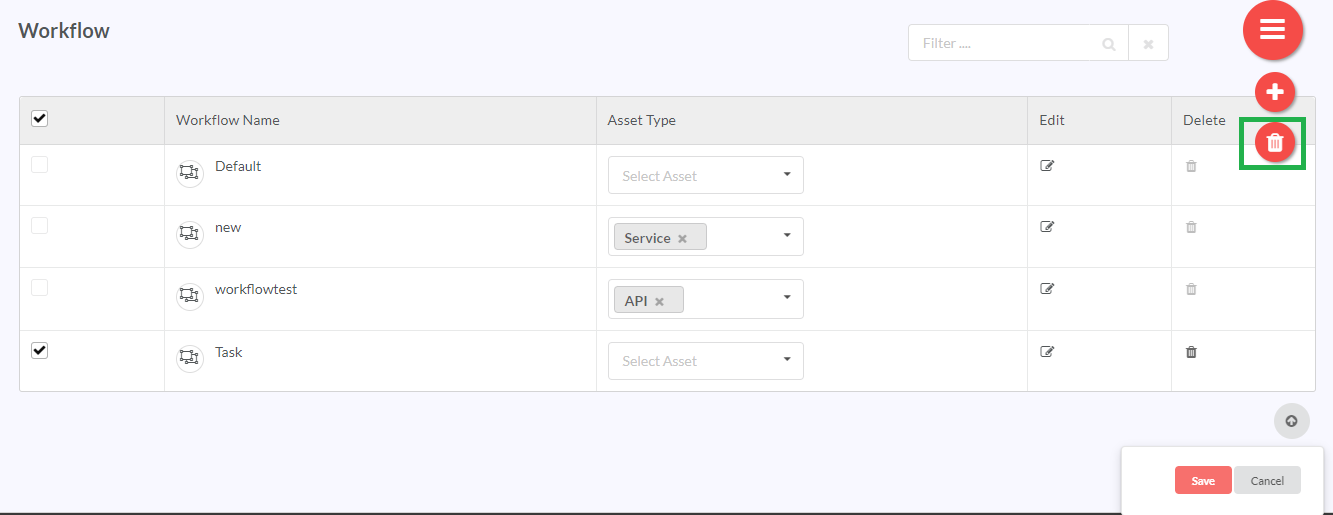
Or select the checkbox corresponding to the Workflow Name you wish to delete, then click the Hamburger menu (
 ) and then click the (
 ) delete icon. You can also delete all the types of the workflows by selecting the checkbox corresponding to the Workflow Name in the header row.
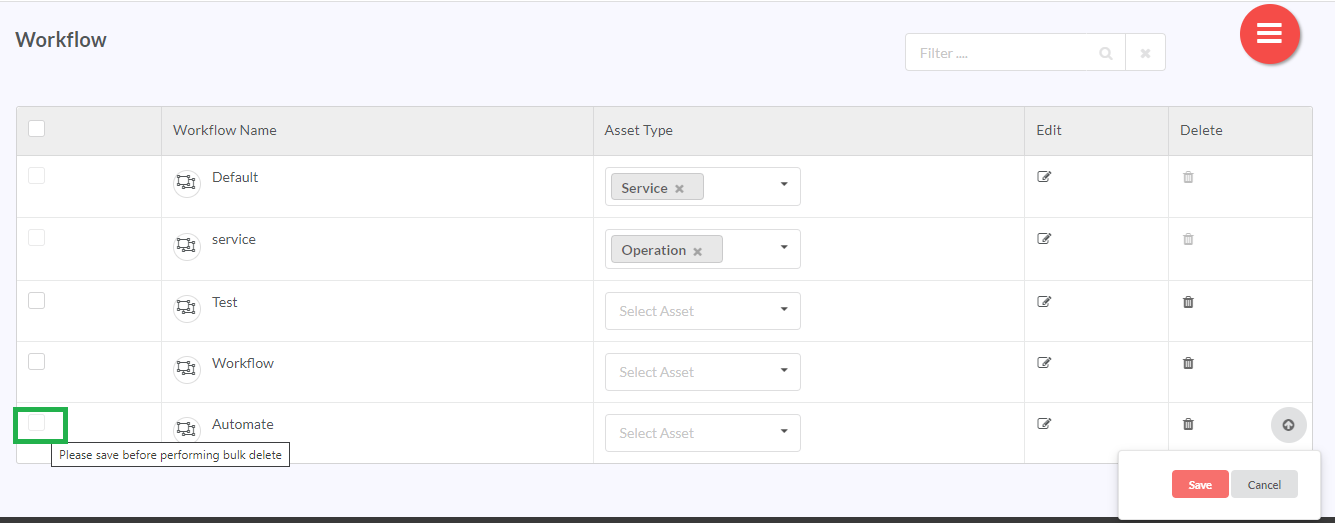
You cannot perform bulk delete or select a check box to delete a newly added workflow if that workflow has not been saved. In such case, the check box corresponding to the newly added but not saved workflow will be disabled as shown in the image below:
You must save the workflow to enable the check box and perform bulk delete.
- Click Yes to delete. A success message displays if the workflow is deleted successfully.
Note
- User will not be able to delete the sample workflow.
- User cannot remove a workflow with an asset assigned to it.
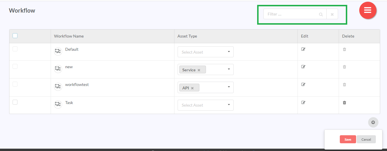
9.6.4. Using the Filter option
RepoPro allows the user to filter out workflow results from the available workflow grid using its “Filter” option present on the Manage Workflow screen. It also allows you to filter results based on all or selective workflow attributes.
To use the filter, in the Filter box, type the keywords you wish to use for narrowing down the results. The Manage Workflow screen updates with fresh results based on the typed keyword(s).
9.6.5. Invoke an API
At this point you must be familiar on how to add/edit/delete workflows. In this section you will learn how to invoke an API defined for a state in a workflow.
Admin users can define APIs for each state of a workflow that will be invoked at the time of state change at instance level. If an API is defined for a state in a workflow, and the instance reaches the state for which the API is defined, then that API will be invoked at the instance level. APIs can be defined either while adding a new workflow or editing an existing workflow.
In case an API is defined for a state in the workflow, but the API call fails when the instance reaches that state, the user will have the option to either allow the instance to change the state or prevent state change from occuring.
9.6.5.1. Add API Details to a Workflow State
To add API details to a new workflow:
- In the main Navigation menu, click the Administer > Information Modelling > Manage Workflow. The Manage Workflow screen displays the list of already created workflows.
In the Manage Workflow page, click the Add icon (
 ) to create a new workflow. The Create Workflow page displays.
Create a new workflow. Given below is a sample workflow.
- Once the workflow is created, click the settings icon (
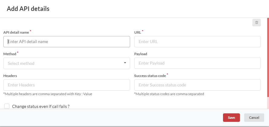
 ) corresponding to a workflow state to open the Add API details page.
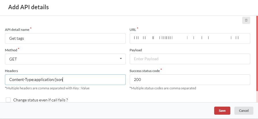
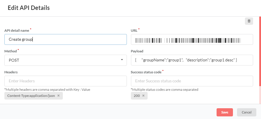
- In the Add API details populate the mandatory details:
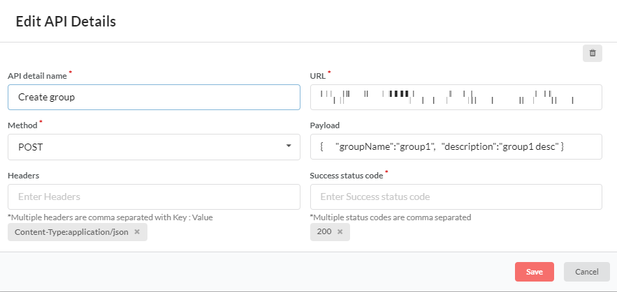
- URL: URL to access the API.
- Method: Method to invoke the API (such as GET, POST, or DELETE etc.).
- Payload: Data sent to server while invoking the API. This field is optional.
- Headers: Information regarding content type. Ensure that multiple headers are separated by comma having Key:Value format. This field is optional.
- Success status code: Expected response codes. If the success code entered here is not returned by the API, it signifies that the API call has failed. Ensure that multiple status codes are separated by comma.
- Change status even if call fails? : Check box to select whether the instance state should be changed if the API call fails. If this check box is selected, instance will change state even if API call fails. Inversely, if this check box is not selected, instance will not change state if API call fails.
- Click Save to save the API details.
- Click Save to save the workflow details.
- Click Save on the Manage Workflow screen to finally save the workflow.
You can also add API Details for an existing workflow.
To add API details to an existing workflow:
- In the Manage Workflow page, click the edit icon (
 ) corresponding to the required workflow. The Edit Workflow page of that particular workflow displays.
- Click the settings icon (
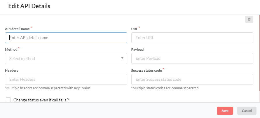
 ) corresponding to a workflow state to open the Edit API details page.
- Click Save to save the API details.
- Click Update to save the workflow details.
- Click Save on the Manage Workflow screen to finally save the workflow.
When the workflow state is changed at the instance level, the API defined for that state will be invoked.
For example:
Let us suppose that a Create group API is defined for asset type service.
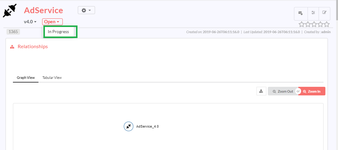
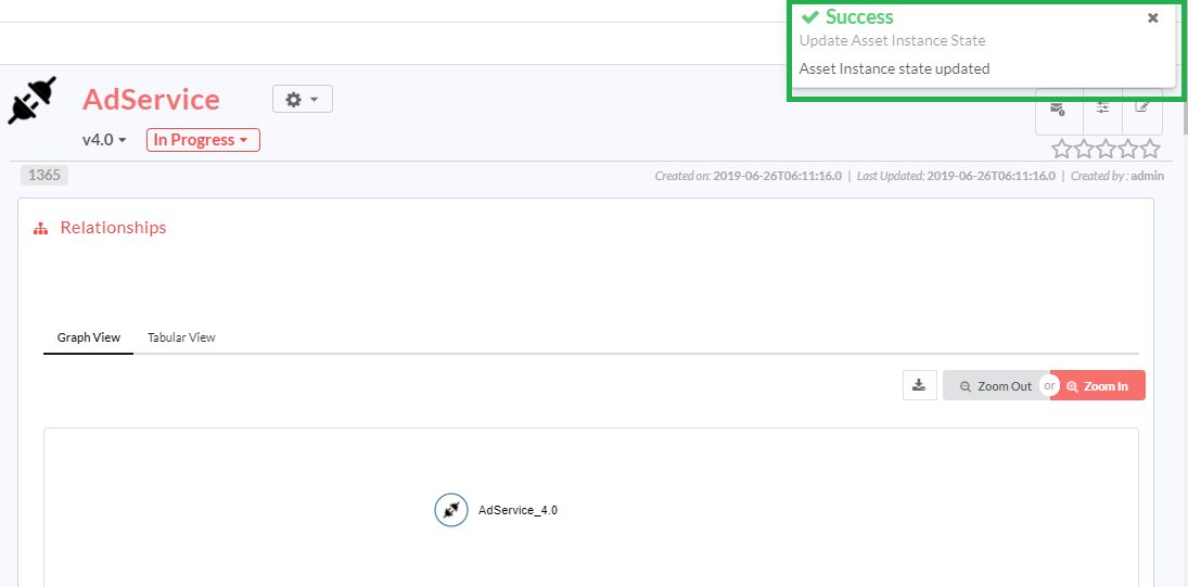
For an instance AdService, workflow state is changed from Open to In Progress,
If the API call is a success existing workflow state will be updated to the new state.
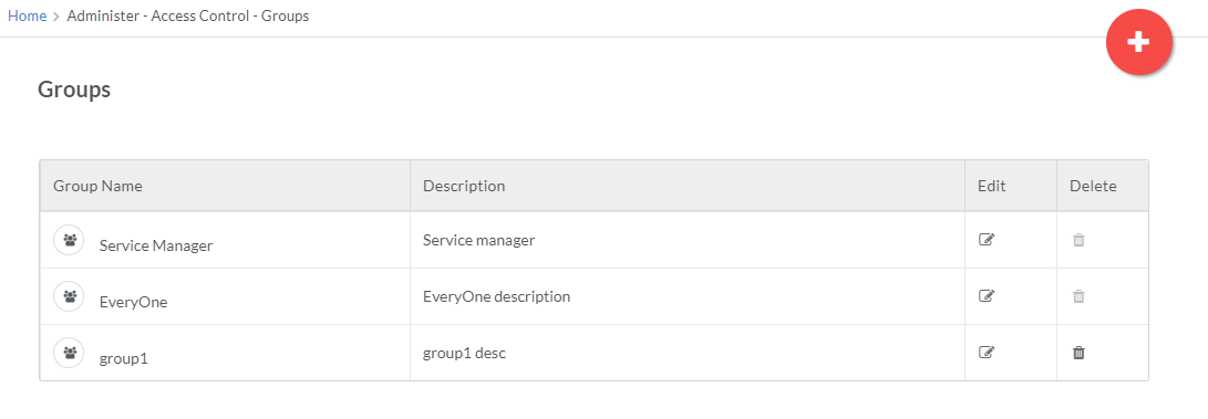
At this state change, Create group API will be invoked and a new group will be created.
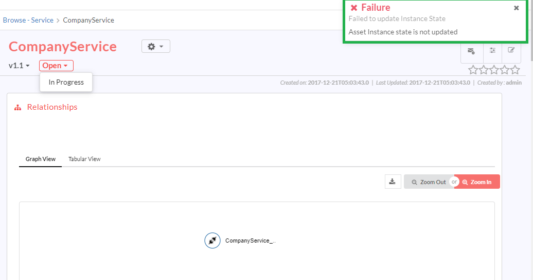
For an API to be invoked, the system will first check the status code of the API call. If the status code is not returned, it means the API call has failed. In this scenario, the system will check whether the Change status even if call fails? check box in the API Details page is selected or not. If this check box is selected, instance will be updated to the new state even if API call fails. Inversely, if this check box is not selected, state will not be updated and the existing state of the instance will be retained.
When the API call fails, an error image will be displayed as shown below.
9.6.5.2. Edit API Details for a Workflow State
To edit API details:
- On the Manage Workflow page, click the edit icon (
 ) corresponding to the required workflow. The Edit Workflow page of that particular workflow displays.
- Click the settings icon (
 ) corresponding to a workflow state to open the Edit API details page.
- Make the necessary changes and click Save.
- Click Update to save the updated details of the workflow.
- Click Save on the Manage Workflow screen to finally save the workflow.
Note
API details for a workflow state can be modified even if the state changes at instance level.
9.6.5.3. Delete API Details from a Workflow State
To delete API details:
- On the Manage Workflow page, click the edit icon (
 ) corresponding to the required workflow. The Edit Workflow page of that particular workflow displays.
- Click the settings icon (
 ) corresponding to a workflow state to open the Edit API details page.
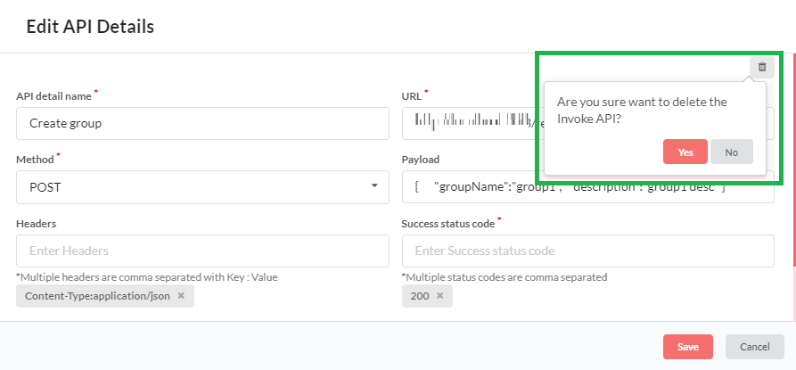
- Click the delete icon (
 ) to delete the API. A message displays asking you to confirm the deletion.
- Click Yes to delete.
- Click Update to save the workflow details.
- Click Save on the Manage Workflow screen to finally save the workflow.
Note
Delete button will be disabled till the user saves the API details.
9.7. Access Control
The user must create Roles, Groups and Users, in that order, to enable Access Control for the users of RepoPro.
9.7.1. Manage Roles
RepoPro manages access permissions for logged-in users through Roles mapped to user functions. User functions for assigning roles are pre-defined in RepoPro and include the following:
- Manage Assets
- Manage Taxonomy
- Manage Relationships
- Manage Roles
- Manage Groups
- Manage Users
- Manage Asset Visualization
The Manage Roles screen provides an infinite scroll view. While scrolling downwards, a scroll icon appears. Click the scroll icon  to be re-directed to the top of the screen.
9.7.1.1. Add Roles
To add a User Role:
In the main Navigation menu, click Administer > Access Control > Roles. The Roles screen displays. The Roles screen displays a grid with all the added Roles listed out.
In the Roles screen, click the Hamburger menu (
 ) and then click the Add icon (
 ) to add a new Role. The Add Role dialog displays.
In the Role Name box, type in a name for the Role you wish to create.
In the Description box, type in a description for the Role.
Click Add to create the new Role.
9.7.1.2. Edit Roles
The user can edit the Role descriptions and assign Roles to one or many Groups.
To edit a Role description and assign or unassign user functions for the Role:
- In the main Navigation menu, click Administer > Access Control > Roles. The Roles screen displays.
In the Description column, click the Edit icon (
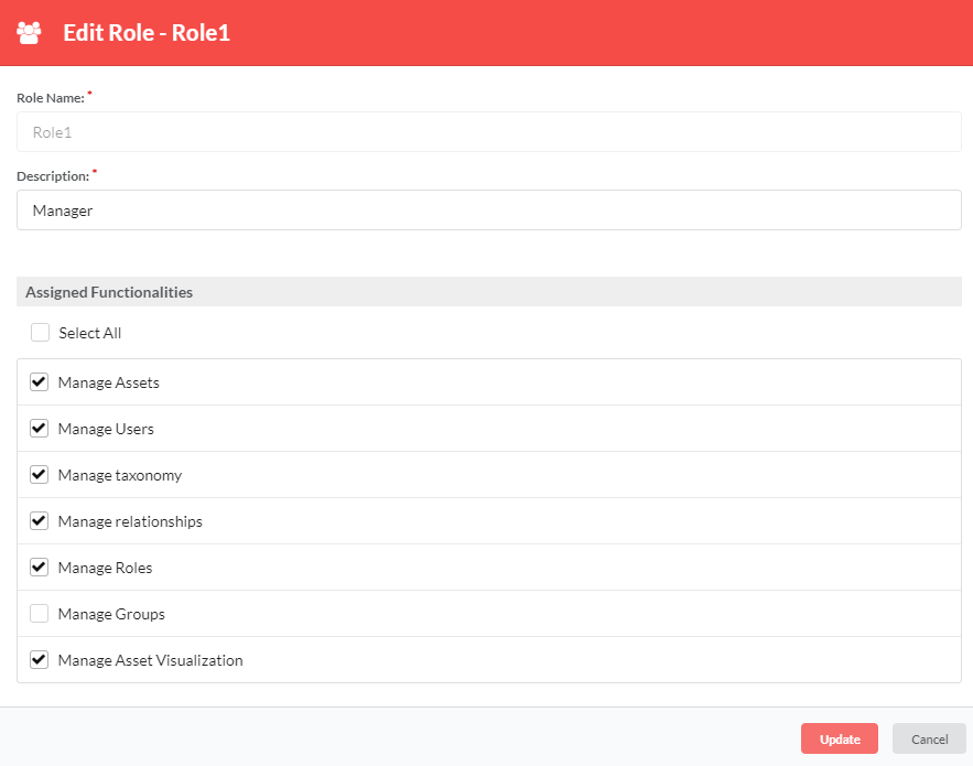
 ) in row that has the Role description you wish to edit. The Edit Role dialog displays.
In the Edit Role dialog, type in the changes to descriptions.
In Assigned Functionalities section, click to select/deselect functions that you wish to assign/unassign to the Role. Alternatively, click to select the Select All checkbox to select all the functions in one go.
In the Assigned Functionalities section, click to select/deselect Manage Asset Visualization. Once the Manage Asset Visualization option is enabled, users can add/edit/delete visualization in the Manage Asset Visualization page.
Click Update to save changes and close the Edit Role dialog.
9.7.1.3. Delete Roles
To delete a User Role:
In the main Navigation menu, click Administer > Access Control > Roles. The Roles screen displays.
In the Delete column, in the row that has the Role you wish to delete, click the delete icon (
 ). A pop up message displays asking you to confirm the action.
Or select the checkbox corresponding to the Role Name you wish to delete, then click the Hamburger menu (
 ) and then click the (
 ) delete icon. You can also delete all roles by selecting the checkbox corresponding to the Role Name in the header row.
Click Yes to delete. A success message displays if the role is deleted successfully.
Note
The User Role to be deleted must not be linked with any User Group.
9.7.1.4. Using the Filter option
RepoPro allows the user to filter out role results from the available roles grid using its “Filter” option present on the Roles screen. It also allows you to filter results based on all or selective Role Names and Description.
To use the filter, in the Filter box, type the keywords you wish to use for narrowing down the results. The Roles screen updates with fresh results based on the typed keyword(s).
9.7.2. Manage Groups
RepoPro allows users to assign Roles to Groups (The topic: Manage Roles covered tasks for assigning pre-defined functions to Roles). You can create any number of Groups, and each Group can be associated with multiple Roles. RepoPro uses a grid (as seen in the below figure) to display the group details.
The Manage Groups screen provides an infinite scroll view. While scrolling downwards, a scroll icon appears. Click the scroll icon  to be re-directed to the top of the screen.
9.7.2.1. Add a Group
To add a Group:
In the main Navigation menu, click the Administer > Access Control > Groups. The Groups page displays listing the available Groups in a grid view.
In the Groups screen, click the Hamburger menu (
 ) and then click the Add icon (
 ) to create a new Group.
The Add Group dialog displays.
In the Group Name box, type in the Name for the Group you wish to create.
In the Description box, type in a description for the Group.
Click Add to complete creating the new Group.
9.7.2.2. Edit a Group
To edit a Group:
In the main Navigation menu, click the Administer > Access Control > Groups. The Groups screen displays.
In the Groups screen, in the Edit Column, click the Edit icon (
 ) in the row that has the Group name that you wish to edit.
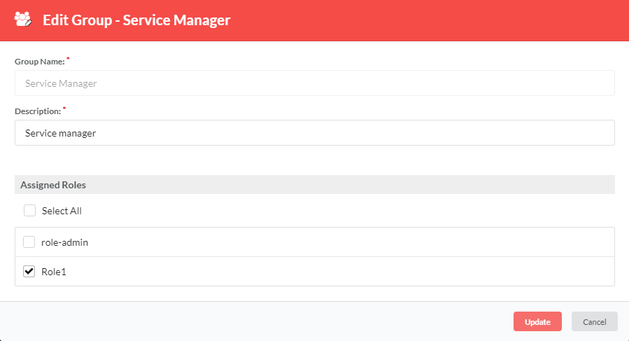
The Edit Group dialog displays.
Type to edit the Group Description box.
In the Assigned Roles section, click to select the checkboxes representing the Roles to assign or unassign to the Group. Alternatively, click to select Select All to mark all the Roles.
Click Update to finish editing the Group.
9.7.2.3. Delete a Group
To delete a Group:
In the main Navigation menu, click the Administer > Access Control > Groups. The Groups screen displays.
In the Groups screen, in the Delete Column, click the Delete icon (
 ) in the row that has the Group that you wish to delete. A pop up message displays asking you to confirm the action.
Or select the checkbox corresponding to the Group Name you wish to delete, then click the Hamburger menu (
 ) and then click the (
 ) delete icon. You can also delete all groups by selecting the checkbox corresponding to the Group Name in the header row.
Click Yes to delete. A success message displays if the group is deleted successfully.
Note
For the Delete option to work, the Group that the user wishes to delete must not be linked with any user.
9.7.2.4. Using the Filter option
RepoPro allows the user to filter out group results from the available group grid using its “Filter” option present on the Groups screen. It also allows you to filter results based on all or selective Group Names and Description.
To use the filter, in the Filter box, type the keywords you wish to use for narrowing down the results. The Groups screen updates with fresh results based on the typed keyword(s).
9.7.3. Manage Users
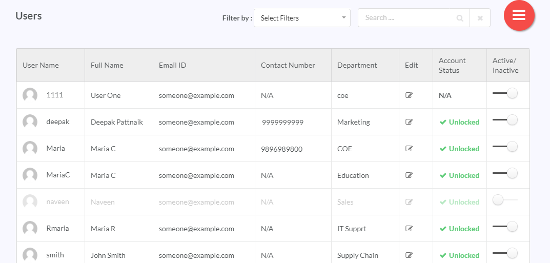
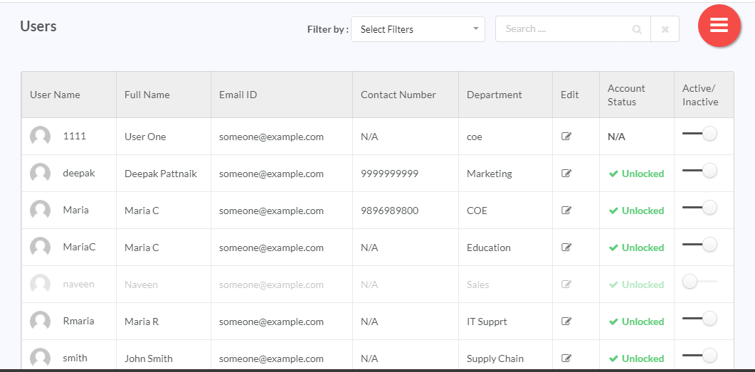
The Manage Users feature allows you to add/activate/deactivate/edit user details. The Manage Users screen provides an infinite scroll view. While scrolling downwards, a scroll icon appears. Click the scroll icon  to be re-directed to the top of the screen.
9.7.3.1. Add a User
The Add User option depends on the Global Settings set for authentication.
- When using LDAP, the password authentication of a user logging in, would happen from LDAP; provided you had first added the user to the RepoPro database. To add users from LDAP, use the “Add Users from LDAP” button to get a grid containing user list from LDAP, and then add selected users to the RepoPro database. When set to LDAP, only Export Data option is available from the hamburger menu (the user cannot use Import Profiles).
- In case of native authentication, RepoPro uses its database to authenticate the user logging in. The RepoPro database stores the password.
For instructions on using Global settings, visit: Global Settings.
To add a user:
In the main Navigation menu, click the Administer > Access Control > Users. The Users screen displays.
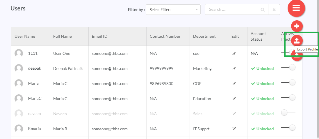
Hover over the hamburger menu to display the options, and then click the Add icon (
 ) to display the Add User dialog.
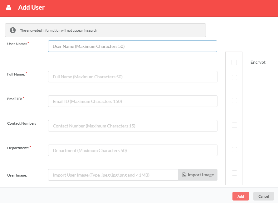
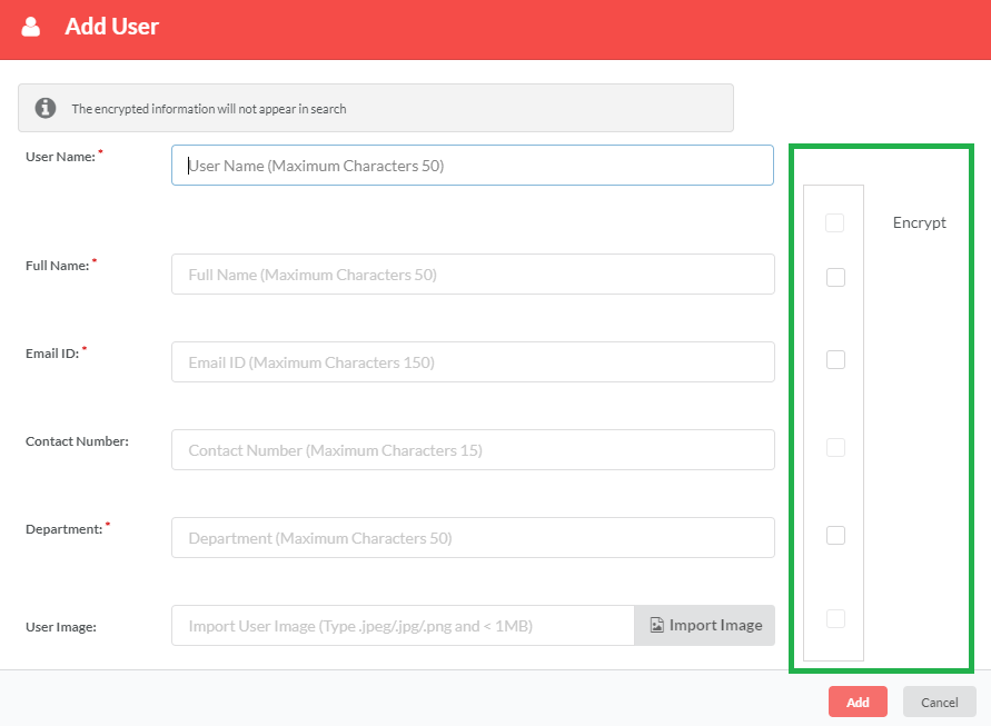
In the Add User dialog, fill in the fields: User Name, Full Name, Email ID, and Department.
Note
Multiple users can use the same email ID in the Email ID field.
(Optional) In the Contact Number field, enter your contact number. You can enter numerals with a minimum of 10 digits and a maximum of 15 digits. Users with no contact number will be displayed as N/A under the Contact Number column on the Users screen.
(Optional) In the User Image field, click Import Image to import an image for your profile from your computer.
Note
Use images with JPEG or PNG format with a file size of less than 1 MB.
For Encrypt Information, click to select/deselect check boxes corresponding to Full Name, Email ID, Contact Number, Department and User Image fields that you wish to hide/show from other users of the application. You can encrypt/unencrypt all user details at one go by selecting/deselecting the check box corresponding to Encrypt Information label.
Note
If user image or contact number is not added, then the Encrypt Information check box corresponding to the User Image or Contact Number field will be disabled. In such cases, the check box corresponding to Encrypt Information label that allows you to encrypt/unencrypt all user details at one go, will also be disabled.
Note
The encrypted information will not appear in search.
Data encryption feature allows users to securely protect their personal data from other users of RepoPro application. When you encrypt your data, RepoPro will convert that data into an unreadable format to prevent others from viewing it. Any logged in user is able to read his data even though it is secured and also if the logged in user has manage user access. If not then the user details will be in non-readable format.
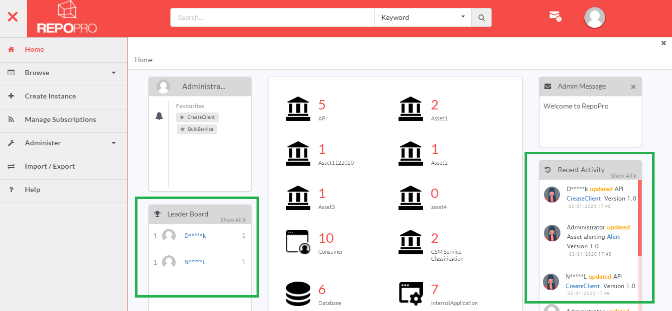
If encrypted, user details will be displayed in an encoded format that will be stored in the RepoPro database. For example, full name John Smith when encrypted will be displayed as J*****H in the application. First and last letter of the full name will be visible, while the rest of the letters will be masked by five * symbols. The same applies for all the fields that can be encrypted. Encrypted user image will be replaced by a generic default image.
Note
- Logged-in users will be able to view their own user details as Plain Text.
- To users who have Manage Users access, secured details of other users will be displayed as Plain Text on the screens where user details are displayed.
- To users who do not have access to Manage Users, secured details of other users will not be readable on the screens where user details are displayed.
Click Add to create the new user.
Note
Exported user data that is downloaded in XLSX format will be visible in plain text regardless of whether it has been secured or not. In the exported data file, apart from the user data, three additional columns namely, Full Name Encrypted, Email-Id Encrypted & Department Encrypted are appended that will specify whether the user wishes to keep his details secured or not. These three columns will be validated for integer values 1 or 0. Value “1” indicates that the user wants to keep his details secured, if not, the value will be “0”.
For example if a user has secured their Full Name, then for this particular user, the value in the Full Name Encrypted column will be 1. If this same user has not secured their Email ID, the value in the Email-Id Encrypted field will be 0.
If a user’s user data was previously unsecure, he can make his details secure in the exported data file and import the same into the application. The details that were previously visible in the UI will be then be displayed in an unreadable format to other users of the application, provided they don’t have access to Manage Users.
For example, let us suppose that a user has exported his user data file. In the exported file, Email ID field was not secure. Hence in the Email-ID Encrypted column the integer value was displayed as 0. If the user wishes to secure this field, he can change the value to 1, and then import this same user data file into the application. After importing, the Email ID field will be displayed in unreadable format to other users of RepoPro application, provided they don’t have access to Manage Users.
9.7.3.2. Edit a User
To edit details of a User:
In the main Navigation menu, click the Administer > Access Control > Users. The Users screen displays.
In the Edit column, click the Edit icon (
 ) in the row that has the User you wish to edit.
The Edit User dialog displays.
In the Edit User dialog, edit the fields: Full Name, Email ID, Contact Number and Department to make changes.
Note
User Name field, being a reserved field, is not available for editing.
In the User Image field, click Import Image to import a different image from your computer.
For Encrypt Information, click to select/deselect checkboxes corresponding to Full Name, Email ID, Contact Number, Department and User Image fields that you wish to hide/show from other the users. You can encrypt/unencrypt all user details at one go by selecting/deselecting the checkbox corresponding to Encrypt Information label.
Note
If user image or contact number is not added, then the Encrypt Information check box corresponding to the User Image or Contact Number field will be disabled. In such cases, the check box corresponding to Encrypt Information label that allows you to encrypt/unencrypt all user details at one go, will also be disabled.
Note
Any logged in user is able to read his data even though it is secured and also if the logged in user has manage user access. If not then the user details will be in non-readable format.
In the Assigned Groups section, click to select/deselect checkboxes corresponding to Groups that you wish to assign/detach from the user.
Click Update to save changes and close the dialog.
If the logged-in user attempts to remove or unassign an assigned Group from a user, the below rule applies:
- If the Group has any assigned Role that has the Add Asset Instance user function associated with them and there are users under that Group having Add Instance rights for any Asset Type, removing the user from the Group is not allowed.
9.7.3.2.1. Activate/deactivate a User
To activate/deactivate a User:
In the main Navigation menu, click the Administer > Access Control > Users. The Users screen displays.
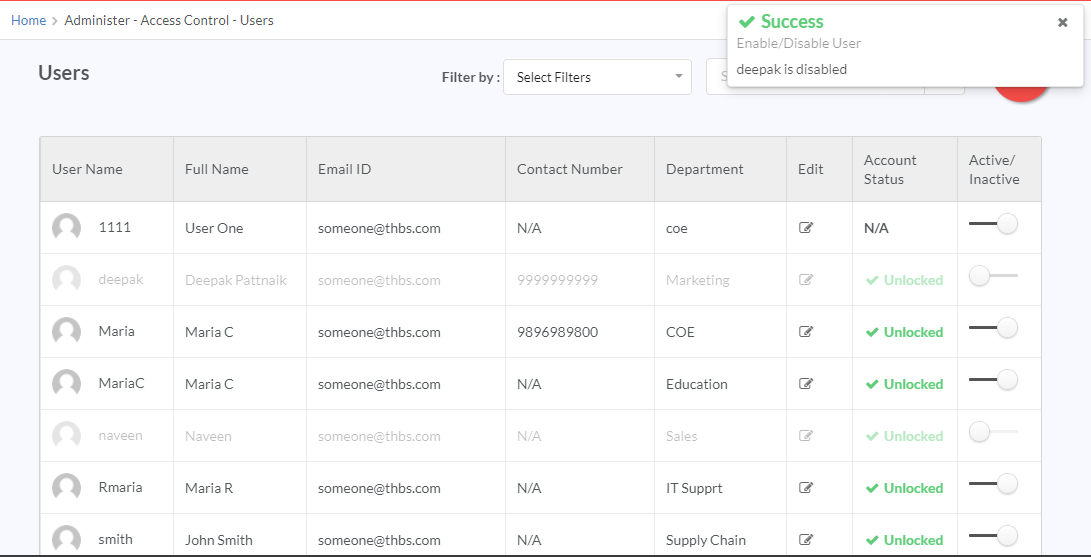
In the Active/Inactive column, in the row that has the User name that you wish to activate, click and drag the toggler to your right.
Inversely, click and drag the toggler to your left to deactivate the user. A notification message displays confirming your action.
9.7.3.2.1.1. Add Users from LDAP
Note
Use this option if the Web Authentication Mechanism in Global Settings is set to LDAP and Native.
To add User profiles from LDAP:
In the main Navigation menu, click the Administer > Access Control > Users. The Users screen displays.
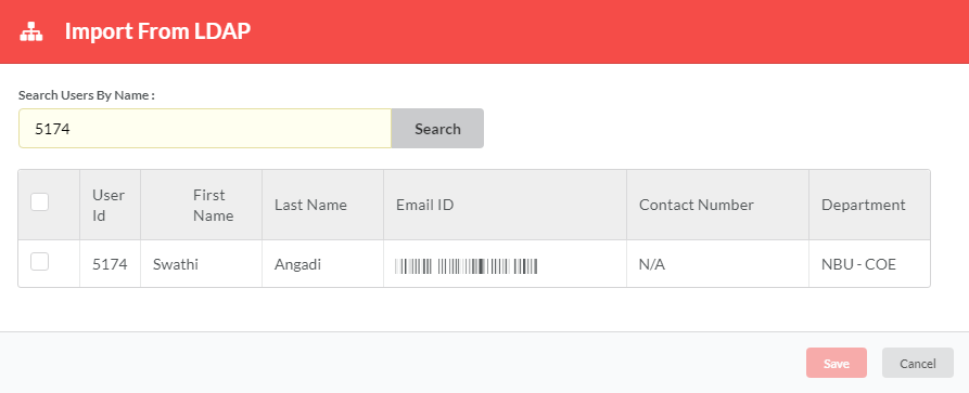
Hover over the hamburger icon to display the options, and then the Add Users from LDAP (
 ) to display the Add Users from LDAP dialog.
In the Search Users By Name field, enter any parameter value for User ID, First Name, Last Name, Email ID, Department Name. Click Search to search users whose profile you wish to import.
Click Save to save the selected LDAP user.
9.7.3.2.1.2. Import Users from Excel
Note
Use this option if the Authentication Mechanism in Global Settings is set to Native Database only and SAML and Native users..
To import User profiles from Excel:
In the main Navigation menu, click the Administer > Access Control > Users. The Users screen displays.
Hover over the three-lined icon to display the options, and then click the Import icon (
 ) to display the Import Profiles dialog.
In the Select the XLSX file to be imported field, click Import to choose a file in Excel format to import from your computer.
Click Import to start the import process.
Some important notes regarding importing user profiles:
- Only files with “.xlsx” extensions can be uploaded.
- The Excel file should be in the same template as obtained from Export User Data below (Refer the next topic). The application validates the file before it is processed.
- User Name cannot be edited. All the other fields in the Excel sheet are editable.
Note
If an error(s) is found, the user is notified by email with the list of errors found. If the processing is successful, the user receives a notification through email with a success message. Those users whose profiles are modified as a result of the import are notified by email. A new user added via the Import option has the default password as “password”.
9.7.3.2.2. Export User Data
To export User data:
In the main Navigation menu, click the Administer > Access Control > Users. The Users screen displays.
Hover over the three-lined icon to display the options, and then click the Export icon (
 ). A Confirmation message displays. In the Confirmation dialog, click OK to start the Export process.
The file to which the exported data is stored is named in this format:
Profile_Export<identification_number>.xlsx. The file downloaded is in the XLSX format.
9.7.3.2.2.1. Unlock locked account
Note
If the super-admin user gets locked out, contact the RepoPro support team to reset the account.
To unlock locked out account:
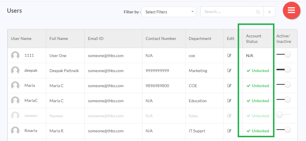
In the main Navigation menu, click the Administer > Access Control > Users. The Users screen displays. A locked account displays in red with the locked status.
Note
The Unlock options in the Account Status column displays in the enabled state only when a super-admin users is logged in.
In the Account Status column, click the row that has the locked account to unlock it.
9.8. Using the Filter option
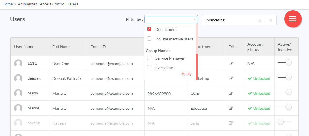
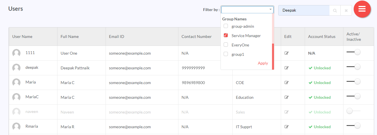
RepoPro allows the user to filter out user results from the available user grid using its “Filter” option present on the Users screen. It also allows you to filter results based on all or selective User Attributes and Group Names.
- In the Search Filter box, enter the search value.
- From the Select Filters drop-down, select the User Attributes using which you want to get the required results. You can select one or more than one User Attribute in the filter. The available User Attributes are: User name, Full name, Email ID, Contact Number, Department, Include Inactive Users. Selecting Include Inactive Users check box allows you to include inactive users in the search results. De-selecting this check box will exclude inactive users from the search results.
- After selecting the User Attributes, click Apply and then click search
 . Click
  to clear all the selections. The Users screen updates with fresh results based on the keyword and filter applied.
Along with the User Attributes, you can also filter results based on list of groups i.e. Group Names.
- In the Search Filter box, enter the keywords.
- From the Select Filters drop-down, select the Group Names using which you want to get the required results. You can select one or more than one Group Name in the filter from the list of available Group Names. Selecting Everyone allows you to include users belonging to all Group Names in the search results.
- After selecting the Group Names, click Apply and then click search
 . Click The Users screen updates with fresh results based on the keyword and filter applied.
9.9. Miscellaneous
9.9.1. Message Board
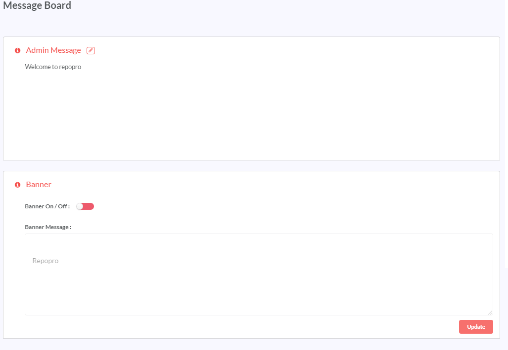
RepoPro provides two means for the admin to communicate important updates to RepoPro users: Admin Message and Banner.
9.9.1.1. Admin Message
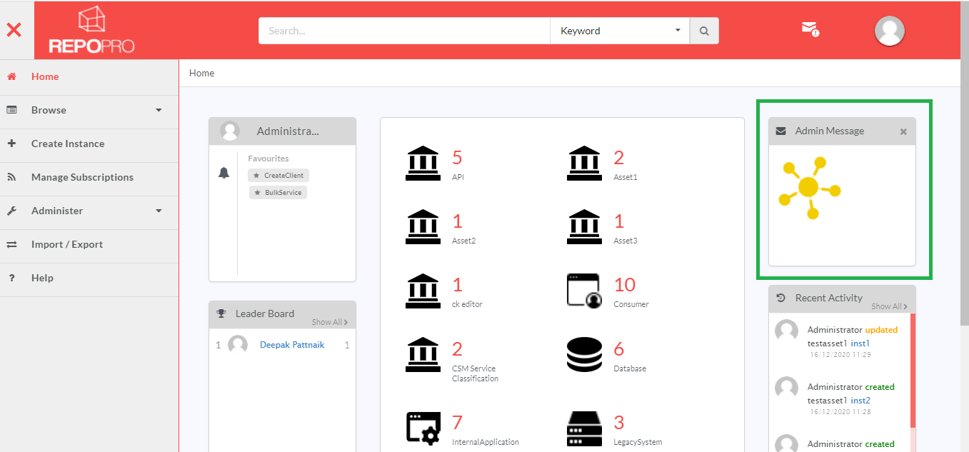
The admin user can set a message that should be displayed in the Admin Message widget.
In the main Navigation menu, click Administer > Miscellaneous > Message Board. The Message Board screen displays.
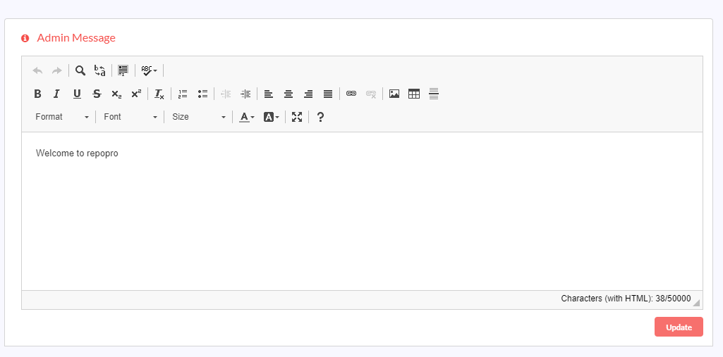
In the Admin Message section, click the Edit icon (
 ) to display the rich-text editor.
Enter in the admin message to display. Use the formatting options available in the rich-text editor interface to make changes to the text. You can also upload an image in the description using the (
 ) icon in the rich-text editor plugin.
Upload an image:
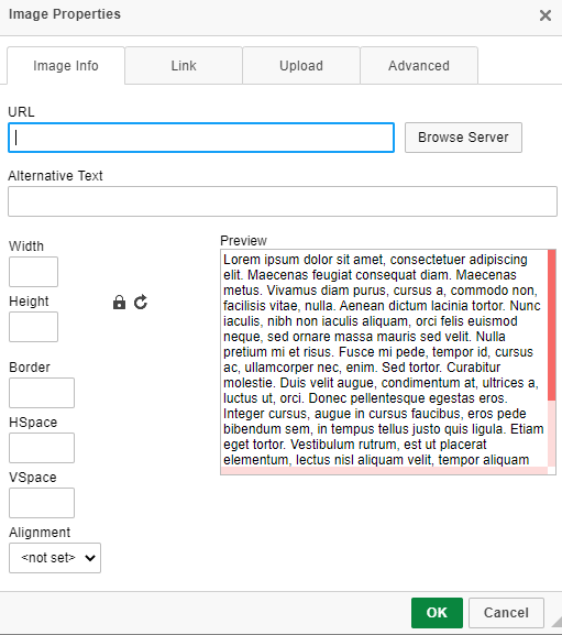
Click the image icon to open the Image Properties dialog.
To upload an image from the web, copy-paste the web image url in the URL box. The Preview box will generate a preview of the image. Enter Alternative Text, if any, to be used. Adjust the width and height of the image in the Width and Height box. Use (
 ) icon to lock aspect ratio. Use (
 ) icon to reset the image size.
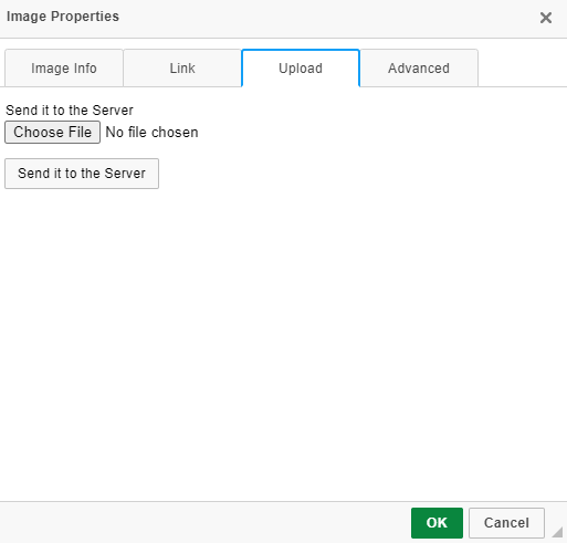
To upload an image from your system, click Upload tab and then click Choose File.
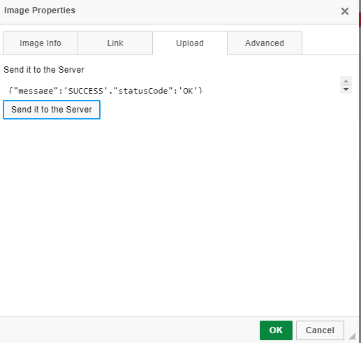
Select an image file from your system and click Send it to the Server. A success message is displayed.
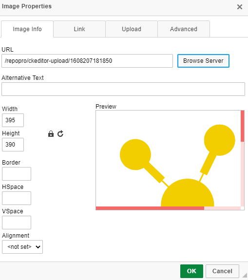
Navigate to the Image Info tab to select the image you sent to the server.
Click Browse Server to select the image you uploaded from your system to the server. Only images that have been uploaded to the RepoPro server will be displayed here.
Preview of the uploaded image will be displayed in the Preview box under the Image Info tab.
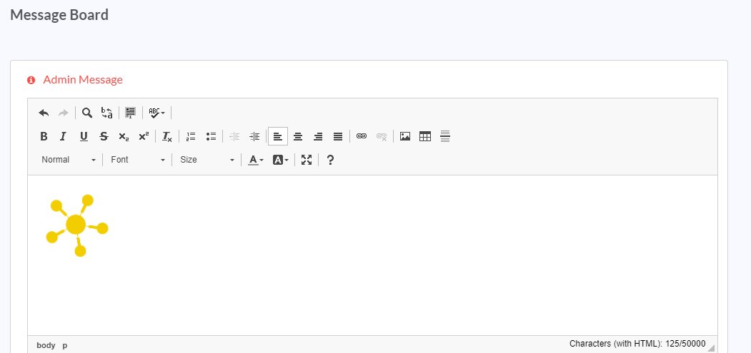
Click OK. The image will be uploaded to the rich-text editor.
Click Update to reflect the changes in the application.
Note
You can also copy an image from your system to the rich-text editor by first copying that image to an image/doc editor and then pasting it to the rich-text editor. Ensure that this image size is not less than the minimum image dimension.
9.9.1.2. Banner
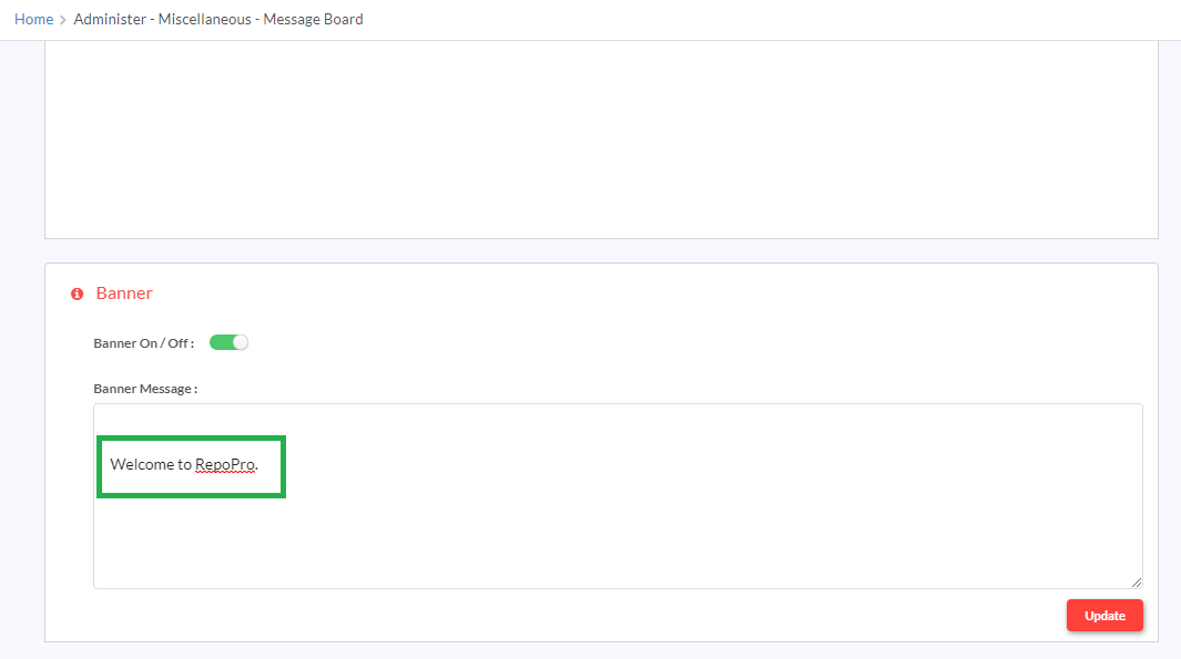
The admin user can set a banner message that scrolls in the header when set on.
In the main Navigation menu, click Administer > Miscellaneous > Message Board. The Message Board screen displays.
Under Banner section, in the Banner On/Off toggler, click and drag the toggler to your right to activate the banner display. Inversely, click and drag the toggler to your left to deactivate the banner display.
In the Banner Message section, in the text box provided, type in the message to display as the banner.
Click Update to reflect the changes in the application.
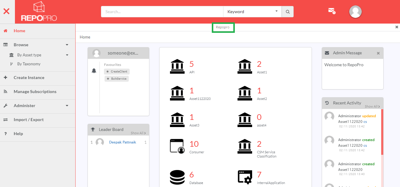
The banner message will be displayed as a scrolling message in the application.
9.9.2. Global Settings
9.9.2.1. User Authentication
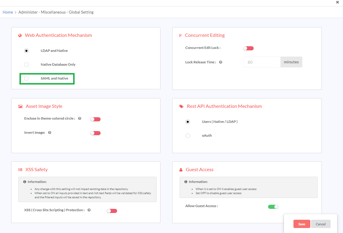
RepoPro supports integration with corporate LDAP for authentication of users as part of its Global Settings. RepoPro enables the authentication of an admin user via the RepoPro database and users cannot be deleted.
For other users, there are three options:
LDAP and Native: In this case user credentials in both LDAP and Native Database are authenticated. For LDAP, the user has to be added to RepoPro database first (Refer: Manage Users), then the authentication can be done from the LDAP. If the mode of authentication is LDAP and Native, there is a configuration file that has to be edited for proper connectivity.
LdapHost=<<Server where the LDAP is hosted>>
LdapPort=<<Port  on the server where LDAP is running>>  LdapAuthenticationType=<<Authentication type for connecting to the LDAP>>
LdapBaseDn=<<Base DN for connecting to LDAP>>
LdapSearchFilter=<< Search Filter for querying user list from the LDAP >>
LdapAuthenticationUserName=<<Authentication User name for connecting to LDAP>>
LdapAuthenticationPassword=<<Authentication password for connecting to LDAP>>
LdapActiveDirectory=<<true if the server is Active Directory, else false>>
LdapUserName=<<Field name in LDAP for User Name>>
LdapFirstName=<<Field name in LDAP for First Name>>
LdapLastName=<<Field name in LDAP for Last Name>>
LdapEmail=<<Field name in LDAP for Email>>
LdapDepartment=<<Field name in LDAP for Department>>
LdapKeyRequired=<<true/false>>  `
LdapCertificateDetails=<<path where certificate is present>>
LdapRefferal=follow
LdapTrustStorePassword=changeit
LdapWildCardSearch=false
LdapFullName=fullName
Native Database only: The users are added to RepoPro database and authenticated through the same.
9.9.2.2. LDAP and Native Database
The table given below details the differences between the LDAP and Native Database modes:
| Mode | How to add user | Login credentials | User logging in for the first time | Change Password | Forgot Password |
|---|---|---|---|---|---|
| LDAP and Native | Through LDAP Directory | Users added through LDAP with LDAP Credentials. Users added through Native DB: with RepoPro credentials | User added through Native DB: change password page. User added through LDAP: Homepage | No | No |
| Native Databases Only | Through RepoPro Add User dialog | Users added through Native DB: RepoPro credentials. Any users added through LDAP mode cannot login. | Navigates to change password page | Yes | Yes |
SAML and Native:
Security Assertion Markup Language (SAML) is a standard single sign-on (SSO) format for authentication and authorization between two entities: a Service Provider (SP) and an Identity Provider (IDP). RepoPro, being the SP, engages the SSO service that the user’s IDP employs, and gets the user authenticated at the IDP and logs the user in to RepoPro.
Configuring RepoPro for Web Authentication mechanism:
Navigate to Administer>Miscellaneous>Global Settings from the main Navigation menu. The Global Settings screen displays.
In Web Authentication Mechanism section, click to select the Authentication type required for accessing RepoPro application from the radio button options: LDAP and Native, Native Database only, or SAML and Native.
Selecting LDAP and Native enables users to be authenticated from the Native database as well as from the LDAP.
Selecting the radio button SAML and Native activates SAML-based authentication, allowing the user to have the option to either be authenticated using SAML or log in using the Native authentication method.
Using the Native Database mode, the user can log in using the RepoPro login URL and the login authentication is made on the user’s RepoPro user credentials.
Authenticating users with SAML:
Note
- Ensure that you have selected SAML and Native as the Authentication mechanism in Global Settings.
- The IDP’s XML configuration file; id.xml needs to be added to the RepoPro WAR.
To authenticate users using SAML:
In your browsers address bar, type the following URL to initiate SAML Authentication:
<repopro login URL>?goWithSAML=true
Next, the following sequence of events takes place:
- The browser redirects the user to the SSO service that the user’s IDP employs for authentication. Simultaneously, RepoPro sends a SAML request to the IDP for authenticating the user.
- The IDP’s SSO service loads up the SAML authentication page and validates the SAML request to identify the SP sending the request.
- The user logs in to the IDP’s SSO service, if not already logged in.
- The IDP identifies the user and sends back a SAML response with all the necessary user information to RepoPro.
- The response is validated against the IDP.xml file present in RepoPro database and if found to be matching, logs the user in to RepoPro application with matching credentials. The user is taken to RepoPro homepage.
Note
When a user logs in for the first time using SAML, the user is assigned the ‘Everyone’ Group by default. The ‘Everyone’ Group only has Read-only access. You can later manage the user’s access permissions by changing the user’s group.
9.9.2.3. Concurrent Editing Lock Mechanism
RepoPro supports Concurrent Editing Lock mechanism as part of its Global Settings. When enabled, this feature allows only one user to edit the Overview, Properties and Relationships of an Asset Instance Version.
Note
Composition and Aggregation relationships do not have Concurrent Editing Lock mechanism.
To configure Global Settings:
In the main Navigation menu, click Administer > Miscellaneous > Global Settings. The Global Settings screen displays.
In the Concurrent Editing section, click and drag the Concurrent Edit Lock toggler to your right to turn it green and activate locking of Asset Instance editing. The Edit Lock feature restricts editing of the instance to only one user at one time; thereby disallowing concurrent editing of Asset Instances by more than one user.
Inversely, click and drag the Concurrent Edit Lock toggler to your left to turn it red and deactivate locking of Asset Instance editing.
In the Concurrent Editing section, in the Lock Release Time box, type the time in minutes after which the Concurrent Edit Lock will be released.
9.9.2.3.1. Configuring Asset Image styles
To configure the look and feel of icon images used to represent Asset Types and Instances:
- In the Asset Image Style section, click and drag the Enclose in theme-colored circle toggler to your right to turn it green and enclose the Asset Type and Asset Instance icon images in a theme-colored circle. Inversely, click and drag the Enclose in theme-colored circle toggler to your left to turn it red and have no circle enclosing the Asset type and Asset Instance icon images.
- In the Asset Image Style section, click and drag the Invert Image toggler to your right to turn it green and invert the color used in icon images for Asset Types and Asset Instances. Inversely, click and drag the Invert Image toggler to your left to turn it red and have the color of images showing in their original colors.
9.9.2.3.2. XSS Safety
RepoPro protects itself from XSS (cross-site scripting) vulnerabilities, such as code-injections attacks by allowing the user to turn on a global setting to enable the XSS safety feature.
RepoPro covers the following XSS vulnerabilities:
- Risky HTML elements in user input
- Event handlers (such as when a form is clicked and an onClick() Javascript event is triggered)
The product filters the user input and removes any risky element from the input before saving it in the database. All text inputs and rich-text inputs are covered wherever they are found in the application.
User input is expected in fields, such as while adding Asset Name from the Create New Asset screen. RepoPro filters out some risky tags from the user’s input as an XSS safety measure. Here is a list of all the allowed tags that can be used in user input fields (other than rich-text editor):
9.9.2.3.2.1. Allowed HTML tags in user input fields
| Allowed HTML tags |
|---|
| h1, h2, h3, h4, h5, h6 |
| p, br, hr |
| abbr, address |
| b, bdi, bdo, cite |
| del, dfn, em |
| i, ins, kbd, mark |
| q, s, samp, small |
| strong, sub, sup |
| time, u, var, wbr |
| a, ul, li, ol, dl, dt, dd |
| table, th, tr, td, thead, tbody, tfoot, col, colgroup |
| div, span, header, footer, main, section, article, aside |
| details, dialog, summary |
The user uses the rich-text editor to input descriptions such as Asset Description from the Create New Asset screen. Tags that are allowed when using the rich-text editor are:
| Allowed HTML tags | Allowed Attributes |
|---|---|
| p | style |
| strong | None |
| em | None |
| u | None |
| s | None |
| sub | None |
| sup | None |
| ol | None |
| li | None |
| ul | None |
| a | href,target |
| table | border, cellpadding, cellspacing, style, summary |
| caption | None |
| thead | None |
| tbody | None |
| tr | None |
| td | None |
| th | None |
| hr | None |
| div | None |
| h1-h6 | None |
| address | None |
| span | style |
| pre | data-pbcklang, data-pbcktabsize, class |
To enable the XSS Safety feature for the product:
In the main Navigation menu, click Administer > Miscellaneous > Global Settings. The Global Settings screen displays.
In the XSS Safety section, click and drag the XSS(Cross Site Scripting) Protection toggler to your right to turn it green and activate XSS protection for RepoPro.
Inversely, click and drag the XSS(Cross Site Scripting) Protection toggler to your left to turn it red and deactivate XSS protection for RepoPro.
Click Save to save changes.
If the XSS vulnerabilities safety setting is disabled, the product shall not implement the XSS vulnerabilities protection feature, and shall save unchanged user input to the database.
Note
XSS Safety applies to all channels of user input, be it the UI, XLSX import and ReST APIs.
Configuring REST API Authentication mechanism
In the main Navigation menu, click Administer > Miscellaneous > Global Settings. The Global Settings screen displays.
In the Rest API Authentication Mechanism section, choose the required option between Users (Native/ LDAP) or oAuth to select the Authentication method for accessing REST APIs. For more information on the Authentication methods used in REST APIs, refer the RepoPro REST API documentation.
Click Save to save changes.
9.9.2.4. Guest Access
Temporary users do not require a dedicated account to access RepoPro application. For the benefit of non-registered users, RepoPro offers enabling/disabling guest user access as part of its global settings. When enabled, this feature allows a user to login as ‘Guest’. Users logged in as ‘Guest’ can only view a limited set of the application’s features.
To enable Guest Access:
In the main Navigation menu, click Administer > Miscellaneous > Global Settings. The Global Settings screen displays.
In the Guest Access section, click on Allow Guest Access toggle button to turn it green and activate enabling of Guest Access.
Click Save to save your settings.
On the RepoPro Login page, Continue As Guest button is enabled. Non-registered users can click this button to access RepoPro in Guest mode.
Inversely, click on Allow Guest Access toggler to turn it red and disable Guest Access. The Continue as Guest button will no longer be visible on the RepoPro Login page.
Note
The Guest Access feature is displayed only for Super Admin users.
Tooltip:
You can view the tooltip for each option by hovering your mouse pointer on the ![]() icon. Tooltips are hints that are displayed in a small text box next to an element. In this case, the tooltip will pop up to the right of the element. For example, for XSS Safety, the tooltip will be displayed as shown below.
icon. Tooltips are hints that are displayed in a small text box next to an element. In this case, the tooltip will pop up to the right of the element. For example, for XSS Safety, the tooltip will be displayed as shown below.
9.9.3. Manage Notifications
This section gives information on how admins can manage and configure mail and other notifications.
9.9.3.1. Manage Modules
The RepoPro modules for which notification can be configured is listed under this section. Here the Admin can configure the type of notification that can be set for user. For each module, admin can enable notification either via mail or other alerts or choose both. Selecting Mail alert will send user notification via email. If Other alerts is selected, the notification will be sent to the user either via mail or sms, or both, using external API whenever any action occurs in the application.
To set alerts for modules:
- In the main navigation menu, click Administer > Miscellaneous > Manage Notifications.
The Manage Modules tab displays. To access each module, click on its corresponding tab. Use the
 and
and  icons to expand and collapse the tabs respectively.
The available list of modules and its notification recepient is given in the table below.
Table 9.5 List of Modules¶ Module Notification Recepient User Specific user will get notification if user credentials are modified Asset Subscribed users will get notification Asset Instance Subscribed users will get notification Asset Instance Version Subscribed users will get notification Taxonomy Subscribed users will get notification Export Logged in user will get notification Import Admin user Alerting Whoever has created the rule Mail Configuration Admin
Click the toggle button to turn it to green and activate Mail and/or Other alerts for the required module. Inversely, click the toggle button again to turn it red and deactivate notification for that module.
Click Save to save the settings.
9.9.3.2. Mail Templates
The admin user can configure the templates for the email or sms notification messages triggered from RepoPro. The screen lists the various events in RepoPro that trigger emails/sms, with the message against each. Each event has a set of macros available for use in the template, which are listed against the event. Only the available macros can be used in the mail templates for each event.
Note
It is not mandatory to use the macros in the template.
To edit an template message:
In the main navigation menu, click Administer > Miscellaneous > Manage Notifications.
Under Manage Notifications, click the Manage Configurations tab. The Mail Template tab displays.
In the Mail Template column, click the row that has the message you wish to edit.
Click Save to save the settings.
RepoPro validates the templates, and provides either a message with list of errors found in the templates or a success message saying templates are saved.
Note
Use of percentage symbol (%) as opening and closing tags in the Mail Template text is meant hold variables for macros. The macros that you can embed in the message can be found in the Macros Available column.
9.9.3.3. Mail Configuration
The mail configuration feature of RepoPro allows the Admin to configure mail related details such as user name, password, host, port, sender email id etc. from the application instead of manually running the queries into the database. These details can be modified based on the client requirements. Email will be triggered based on the server configuration details.
Note
Only Admin has access to the mail configuration feature.
To set mail details:
In the main navigation menu, click Administer > Miscellaneous > Manage Notifications.
Under Manage Notifications, click the Manage Configurations tab and then click Mail Configuration. The Mail Configuration tab displays.
In the Mail Configuration page, populate the mandatory details:
- User Name: Enter the Username.
- Password: Enter the Password. By default, the password will be hidden. To view the password click Show.
- Host: Enter the host server name. This is the Server that will send the email.
- Port: Enter the port number for the outgoing email.
- Sender Email Id: Enter the Email Id of the sender which is used when user replies to the same email address. This field is optional but will be auto-populated by default.
- Enable TLS: Select this check box to enable TLS (Transport Layer Security) for the mail server configuration. Deselect this check box to disable TLS.
- Authorize User: Select this check box to enable authorization of the user for the mail server configuration. Deselect this check box to disable user authorization.
Enable TLS and Authorize User options ensure data privacy and security between servers. If both these options are enabled, both user name and password will be authenticated.
Send Test Mail: Click this button to send a test mail. This button allows you to validate the correctness of the information entered above. If the values entered are correct, an email will be sent to your inbox and a success message will be displayed as shown below.
If the details are incomplete or incorrect, the email notification will not be triggered and a failure message will be displayed. The reason for failure can be checked in the database log file.
- After entering the required mail configuration details, click Save.
If the Super Admin has not configured the mail configuration details for a RepoPro user then a warning message will be displayed on the home page of the Super Admin as well as the user for whom it is not set.
9.9.3.4. Notification API Configuration
The Admin can configure notification via API. Notification will be sent to the user either via mail or sms, or both, using external API whenever any action occurs in the application. The Admin can select the modules for which notification has to be configured from the Manage Modules section. The template for the mail or sms notification can be configured in the Mail Templates section.
In the main navigation menu, click Administer > Miscellaneous > Manage Notifications.
Under Manage Notifications, click the Manage Configurations tab and then click Notification API Configuration. The Notification API Configuration tab displays.
Under the Notification API Configuration tab, populate the mandatory details:
- Body: Body of the API. This field is optional.
- URL: URL to access the API.
Note
- If Other alerts is configured in the Manage Module section for a particular module, and if the API wants to use the email ids, templates of message and phone numbers from the application, then API should be implemented in such a way that
$EmailId,$Template,$Phoneas the placeholders for repopro application, so that$EmailIdin the url will be replaced by user’s email id.$Templatewill be replaced by the respective message template of email/sms. In case of sms alerts,$Phonewill be replaced by user’s phone number.- Multiple email ids and phone numbers can be sent as comma-separated using same placeholders as mentioned above.
- The behavior of the Other alerts option depends entirely on external API added under Notification API Configuration module.
- Headers: Information regarding content type. Ensure that multiple headers are separated by comma having Key:Value format.
- Method: Method to invoke the API (such as PUT, POST).
- Click Save. Notifications will be sent based on the API settings.
9.9.4. Help Content
To set the Help content:
In the main Navigation menu, click Administer > Miscellaneous > Help Contents. The Help Contents screen displays.
In the rich-text editor, type in the help content to display. Use the formatting options available in the rich-text editor interface to make changes to the text or upload an image. Refer Upload an image section under Admin Message.
Click Update to save changes. Users can access the saved content from the Help menu option in the main Navigation menu.
Note
- Help content cannot be left empty.
- Help content can take a maximum of up to 50000 characters.
9.9.5. Theming
RepoPro Admins can customize the look and feel of the entire RepoPro application using Theming. Theming allows Admins to style the RepoPro application by changing the application theme color, background, logo, etc. This is useful for users who want to change the default application theme to match their brand or color scheme. For users who do not want to stick to the default application theme, the Admins can create a personalized theme for them. When applied, the customized theme settings will override the default theme settings that is configured for RepoPro application.
To set the Theme:
In the main Navigation menu, click Administer > Miscellaneous > Theming. The Theming page displays the UI sections whose color schemas can be changed.
Theming changes are applicable to:
- Layout
- Button
- Images
- Login Page
Each section has six default colors that can be used to change the color of many components of the UI, namely: Red, Blue, Teal, Violet, Black and Brown. The color that is selected is denoted by a selection circle around that color. The seventh color is the custom color that can be picked from the color picker circle next to it.
Note
The seventh color will get replaced each time you pick a custom color from the color picker. If a default color is selected then the custom color will no longer be visible.
The color picker allows you to select the custom colors and created color schemes of your choice. Click your cursor inside the picker area and use the slider to highlight a color or enter RGB, HSL or Hex values to search for a particular color. Use
to navigate between RGB, HSL and Hex color models.
9.9.5.1. Layout
In the Layout section, you can change the Theme Color and Heading Color.
Theme Color
Theme Color is the color that decides the theme of the entire RepoPro application. It is used for changing the model headers, scroll bars, highlighted tabs, floating icons etc. A major part of the application color will be affected by theme color change.
To select a Theme Color, under the Theme Color section, select from one of the default colors or use the color picker to select a custom color and click Save. A sample image of Theme Color is displayed below.
Heading Color
Heading Color is used for changing the page headings of the application.
To select a Heading Color, under the Heading Color section, select from one of the default colors or use the color picker to select a custom color and click Save. A sample image of Heading Color is displayed below.
9.9.5.2. Button
In the Button section, you can change the Primary Button Color, Secondary Button Color, Primary Button Text Color and Secondary Button Text Color.
Primary Button Color
Primary Button Color is used for changing the color of the primary buttons such as Login, Save, Yes etc.
To select a Primary Button Color, under the Primary Button Color section, select from one of the default colors or use the color picker to select a custom color and click Save. A sample image of Primary Button Color is displayed below.
Secondary Button Color
Secondary Button Color is used for changing the color of the secondary buttons such as Cancel, No etc.
To select a Secondary Button Color, under the Secondary Button Color section, select from one of the default colors or use the color picker to select a custom color and click Save. A sample image of Secondary Button Color is displayed below.
Primary Button Text Color
Primary Button Text Color is used for changing the text color on the primary buttons such as Save, Yes etc.
To select a Primary Button Text Color, under the Primary Button Text Color section, select from one of the default colors or use the color picker to select a custom color and click Save. A sample image of Primary Button Text Color is displayed below.
Note
Ensure to use contrasting colors for Primary Button Color and Primary Button Text Color for good readability.
Secondary Button Text Color
Secondary Button Text Color is used for changing the text color on the secondary buttons such as Cancel, No etc.
To select a Secondary Button Text Color, under the Secondary Button Text Color section, select from one of the default colors or use the color picker to select a custom color and click Save. A sample image of Secondary Button Text Color is displayed below.
Note
Ensure to use contrasting colors for Secondary Button Color and Secondary Button Text Color for good readability.
9.9.5.3. Images
In the Images section, you can change the Image Logo and Image Favicon.
Logo
Logo image on the homepage of the RepoPro application can be changed here.
To select an image for the Logo, click Import File to select and import an image file that represents the Logo from your computer. The file must be in the PNG or JPEG format. The file size should be less than 1 MB. The recommended file dimension is 138 x 120 pixels. A sample image of Logo is displayed below.
Favicon
Favicon is the image that is used as the website icon.
To select an image for the Favicon, click Import File to select and import an image file that represents the Favicon from your computer. The file must be in the PNG, JPG or JPEG format. The file size should be less than 1 MB. The recommended file dimension is 32 x 32 pixels. A sample image of Favicon is displayed below.
9.9.5.4. Login Page
In the Login Page section, you can change the Login Page Logo and Background Image.
Logo
Logo image on the Login page of the RepoPro application can be changed here.
To select an image for the Logo, click Import File to select and import an image file that represents the Logo from your computer. The file must be in the PNG, JPG or JPEG format. The file size should be less than 1 MB. The recommended file dimension is 515 x 317 pixels. A sample image of Logo is displayed below.
Background Image
Background Image on the Login page of the RepoPro application can be changed here.
To select an image for the Background, click Import File to select and import an image file that represents the Background Image from your computer. The file must be in the PNG, JPG or JPEG format. The file size should be less than 1 MB. The recommended file dimension is 2515 x 2508 pixels. A sample image of Background Image is displayed below.
Preview New Theme:
You can preview your selected theme before applying it to the application. Preview new theme button displays a sample page of what the theme looks like, when applied in the RepoPro application.
After selecting the required theme settings, click Preview New Theme.
A sample page of the selected theme is displayed.
Reset Theme:
You can revert to the default theme of RepoPro application using the Reset theme button. All the previous changes made to theme will be reset to the default state.
Click Reset theme to restore the default RepoPro theme.
RepoPro default theme is displayed below.
